About Scaler
Scaler is a technology education platform for working professionals, built around structured programs, live classes, mentorship and placement support.
Overview
Scaler moved its curriculum to an AI-native model. The LMS was built for the previous model and could not represent the new one, so we rebuilt the learner-facing experience around one clear next action per session.
My role
I was the Lead Product Designer, working alongside Kishan. I owned Path-maker and the problem-solving workspace, covering interaction, flows, states and brand application.
Team
Outcomes
711 a week
Learners on the new home on average, 11 weeks running since launch
59.3%
Of the first launch cohort switched the opt-in LMS on
28.6%
Of home visitors reached Core Curriculum classes within seven days
Scaler moved to an AI-native curriculum.
The LMS was built for the previous one.
The LMS sits at the centre of a learner's week. They use it to find what to study, join live classes, practise, ask for help, and understand where they stand in a program they are paying for.
Working professionals
Study around a full-time job, in short, irregular sessions.
The Scaler 3.0 curriculum
Made personalisation, adaptive enrichment and the Companion part of the program itself.
The LMS was built for a fixed curriculum and an unlimited attention span, so it could hold neither.
Sorting before studying
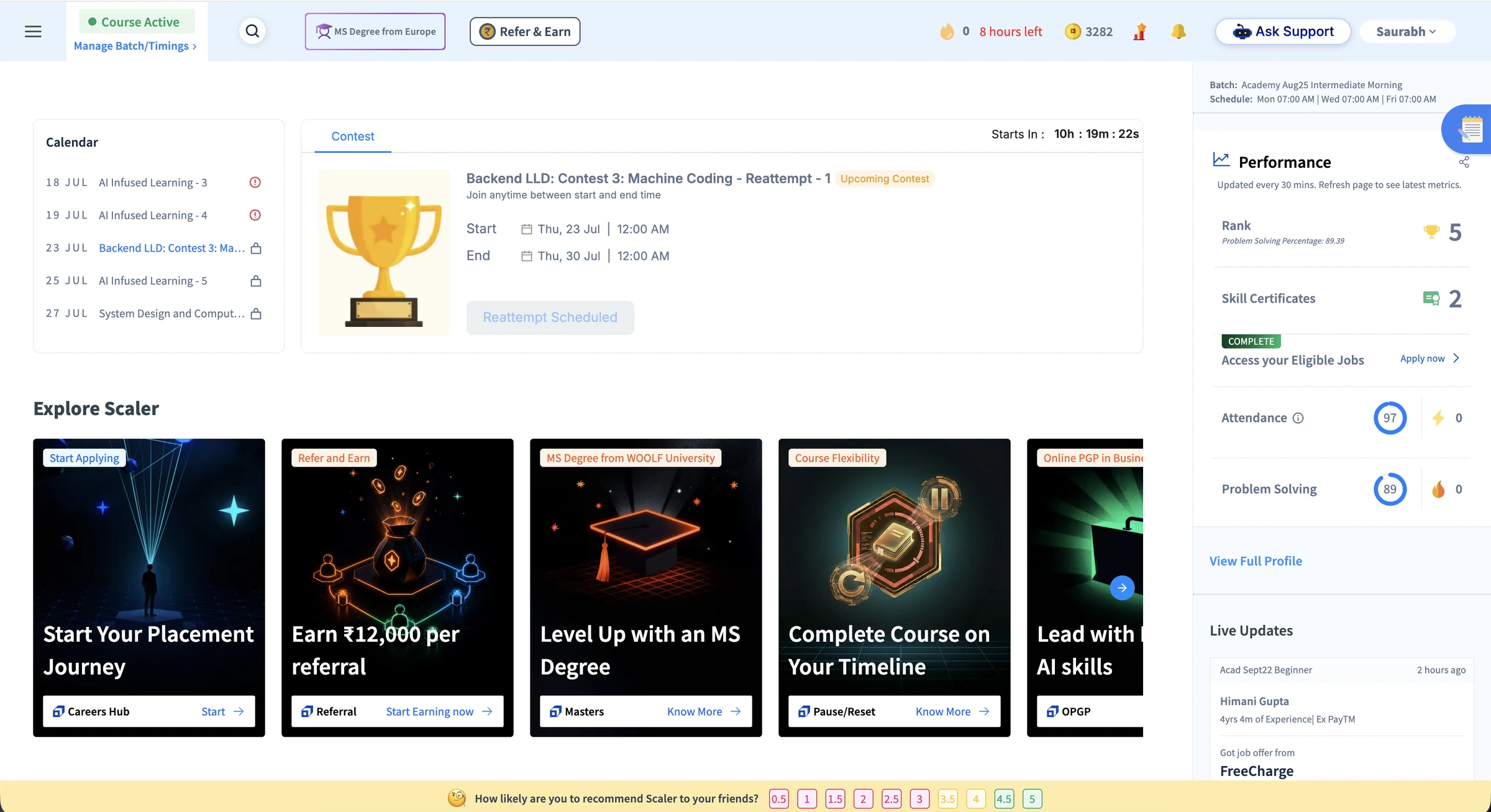
The home page carried Calendar, contests, pending actions, practice, promotions and performance data at the same level. A learner with 40 minutes spent the first of them deciding what the page was asking for.
Six ways to ask for help
Chat GPT Help, Use Hint, Solution Approach, Complete Solution, tutorials and TA requests each ran on different rules. A stuck learner had to pick a support system before receiving any support.
Personalisation surfaced as scattered features. A learner meeting them one at a time had no reason to read the platform as anything other than generic.
Companion first, then hints, then a TA with the attempt attached.
Two designers rebuilt the learner-facing experience. I owned Path-maker and the problem-solving workspace.
Three surfaces,
the same sorting job
Before designing anything, we audited the existing product surface by surface. I audited Path-maker and Problem Solving. Kishan audited Inside Class.
Each module worked well enough on its own. Together they handed the learner a sorting job before any learning could start.
Path-maker, the old home
Eight modules at one visual level. Nothing on the page named the next action.
The old home, scrolled
Activity rows gave a title and a time. Locks gave no cause or route forward.
Inside Class, the old class page
Watch Recording dominated. Nothing prepared the learner before the session.
Revision tools
Flashcards, a Match Game and Revision Notes competed with each other after class.
Problem Solving, the old workspace
Statement, help, editor and history in separate tabs, one visible at a time.
Five feature tours, one screen
ChatGPT help, Expected Output and Companion tours fired at once, with two more queued behind them.
The old submissions table
An answer and a runtime, detached from the error and the guidance used.
Every surface reported status,
and none of it named an action
The audit produced four difficulties that followed a learner through the whole week, whichever surface they were on. Each session started with the learner translating a score into a decision.
Four issues created this problem
Status arrived without direction
Locks, completion percentages, PSP scores, ranks and attendance reported where a learner stood. None of it connected to an action in that day's plan.
The structure mirrored the teams behind it
Class, feedback, practice and progress were separate modules because they were separate teams. Learners were left to join them up into a week.
Context broke at the moment it was needed
Inside a coding problem, the statement, the help and the submission history took turns in one panel, and lab problems sent the code out to a separate VS Code launch.
Help had no continuous home
Six parallel help systems ran in Problem Solving. On the home, nothing revealed why something was recommended or where the Companion fitted.
What the audit found
I audited Path-maker and Problem Solving, and Kishan audited Inside Class. Each surface was read for two things: what was on the page, and what it cost a learner with limited time.
Path-maker notes
Path-maker audit
Every module works in isolation, so the page hands over a sorting job before any learning can start.
Path-maker audit
Nothing identifies a single most important action, and no time-aware hierarchy exists to produce one.
Path-maker audit
Rank, PSP percentage and deficit prompts describe performance without naming an action.
Problem Solving notes
Problem Solving audit
The scoreboard arrives before the purpose of any single problem.
Problem Solving audit
Statement, help and history share one panel, so only one sits beside the editor at a time.
Problem Solving audit
Submissions record an answer and a runtime, detached from the error, the guidance used and the next attempt.
Constraints I had to work with
01
Attention is the constraint
Learners arrive in short, irregular sessions around a full-time job. Every screen had to earn its place in a 40-minute session.
02
Two owners, one experience
Two designers worked on the three surfaces in parallel, and I owned Path-maker and Problem Solving. The surfaces had to share one strategy and ship as one experience.
03
Learners already knew the old flows
Shipping every surface at once would stack three unfamiliar interaction models onto the same seven days, so the release had to be phased.
Three principles across the learner's week
Based on the audit, three principles ran through all three surfaces:
Name one next action, always.
Put the context for that action next to it.
Keep help inside the workflow, never one tab away.
The three surfaces in their final design, each built on the same three principles.
Path-maker
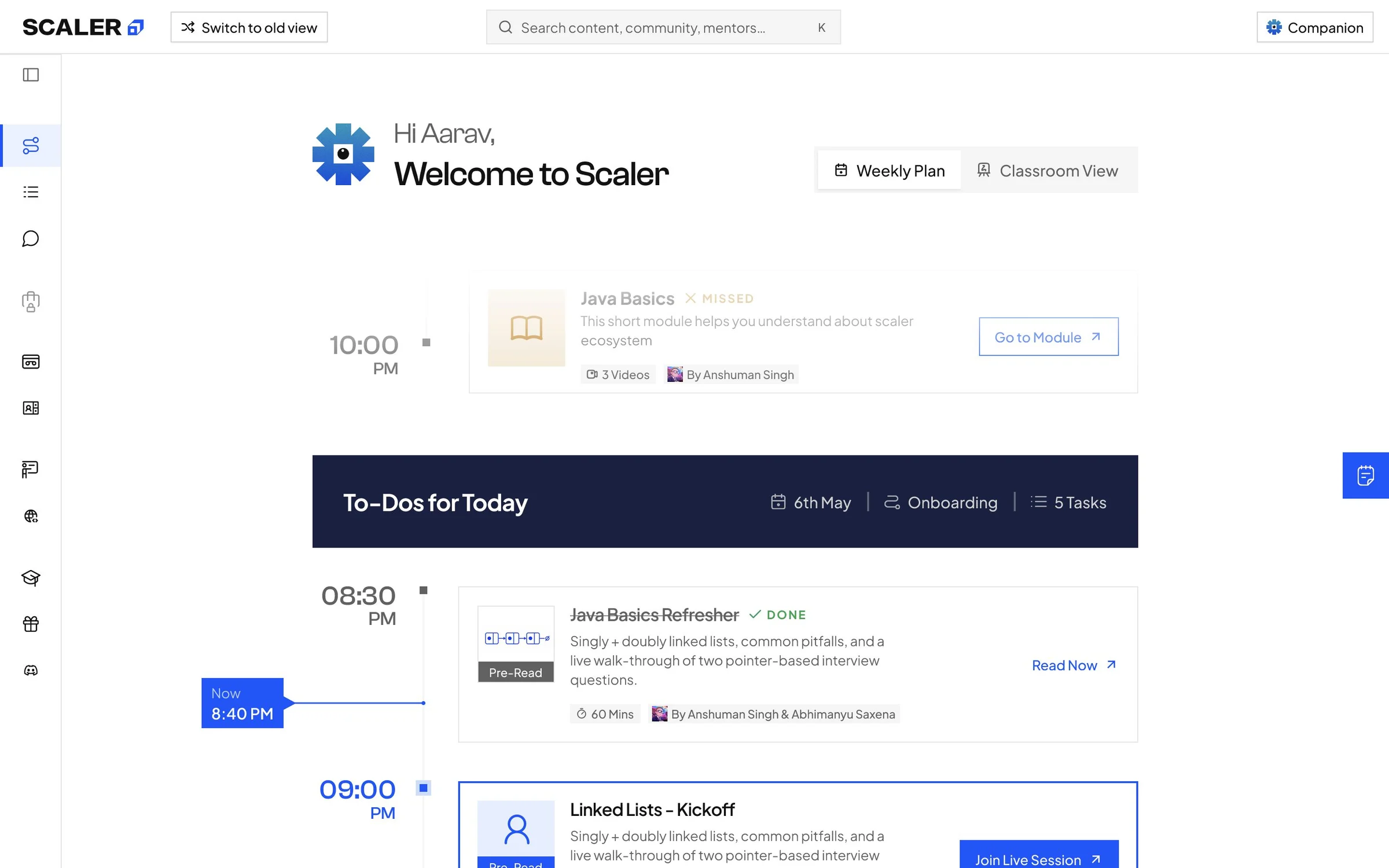
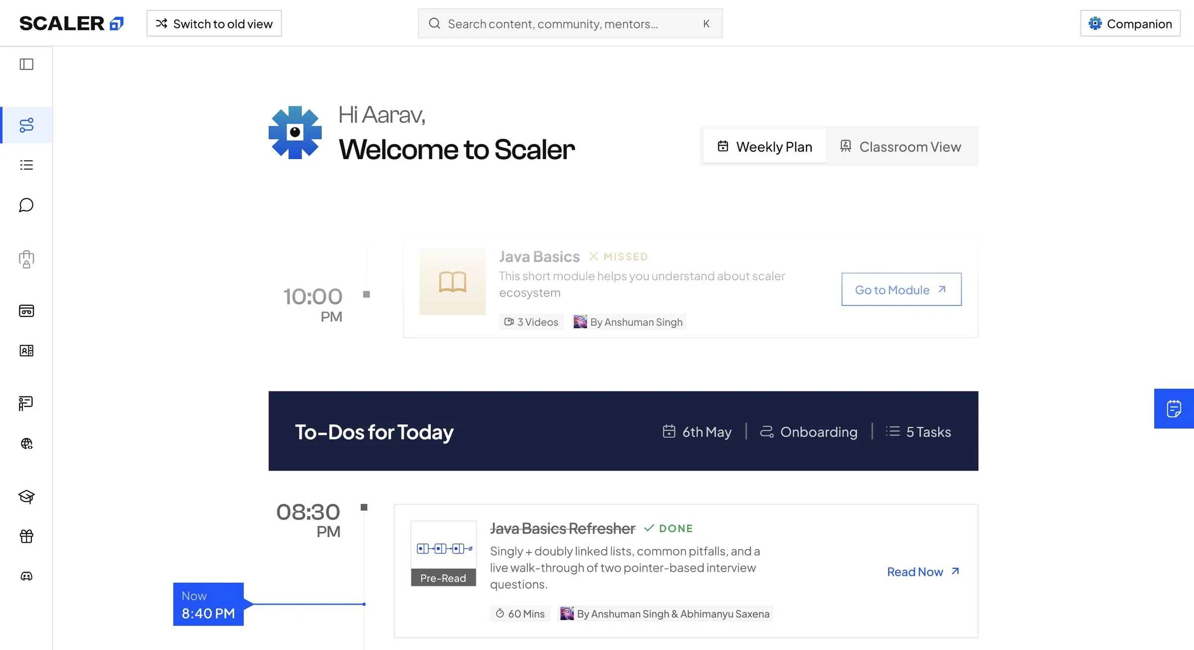
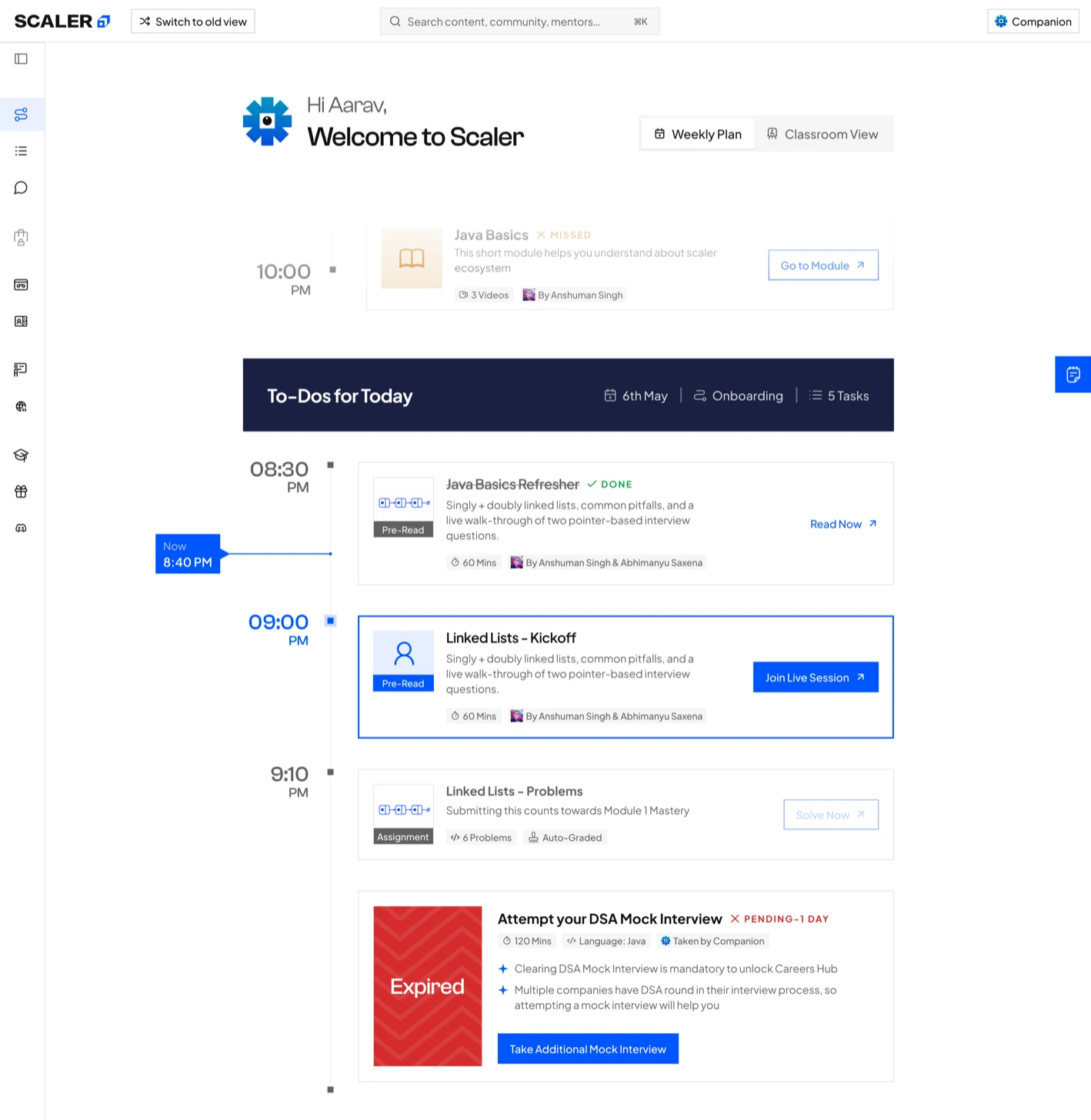
Principle 01, one next action. The Weekly Plan opens on To-Dos for Today, with a Now marker at the current time.
Inside Class
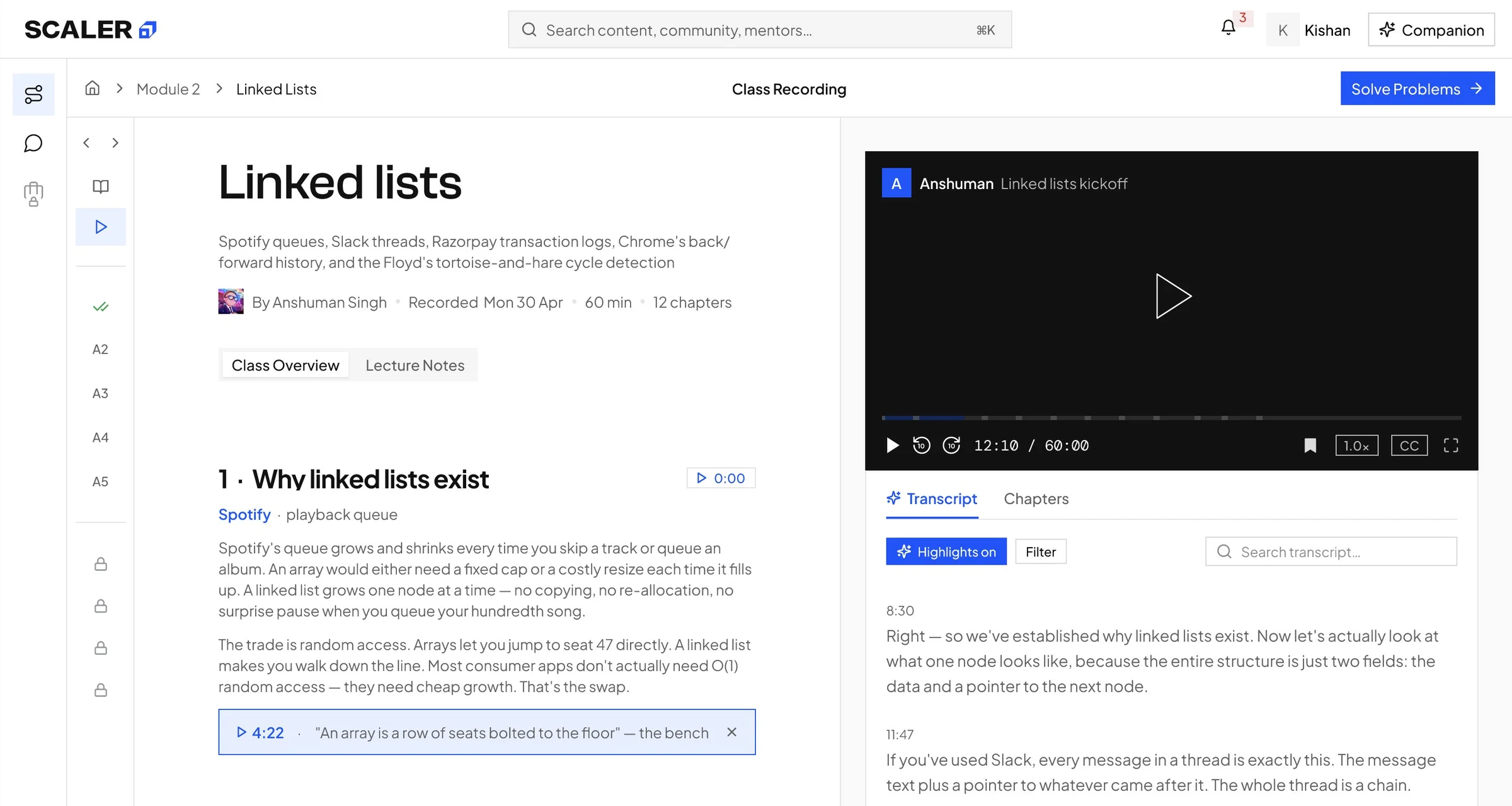
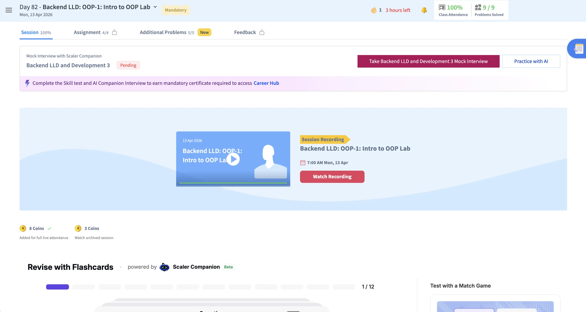
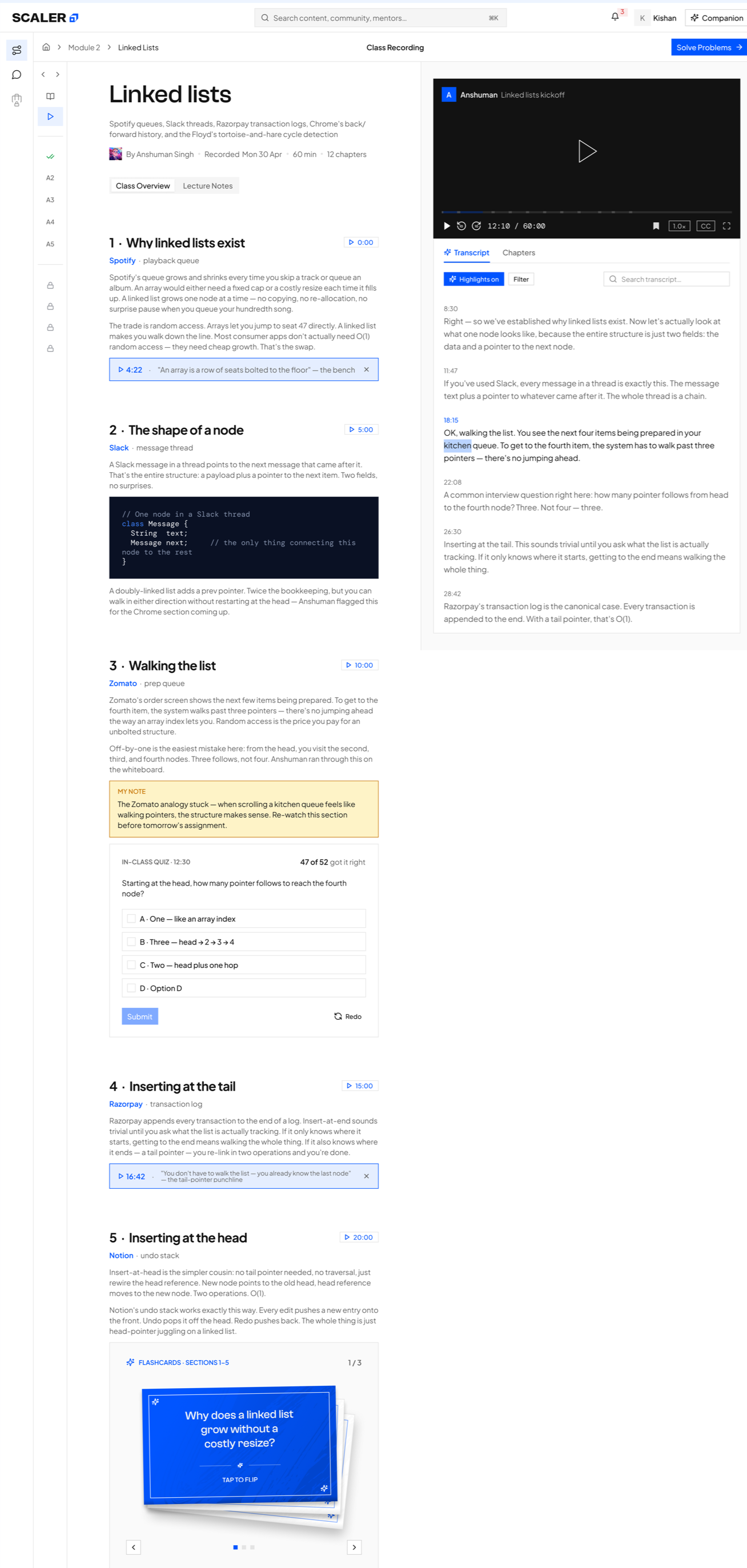
Principle 02, context next to the action. The lesson reads beside the recording, with the transcript and chapters under it.
Problem Solving
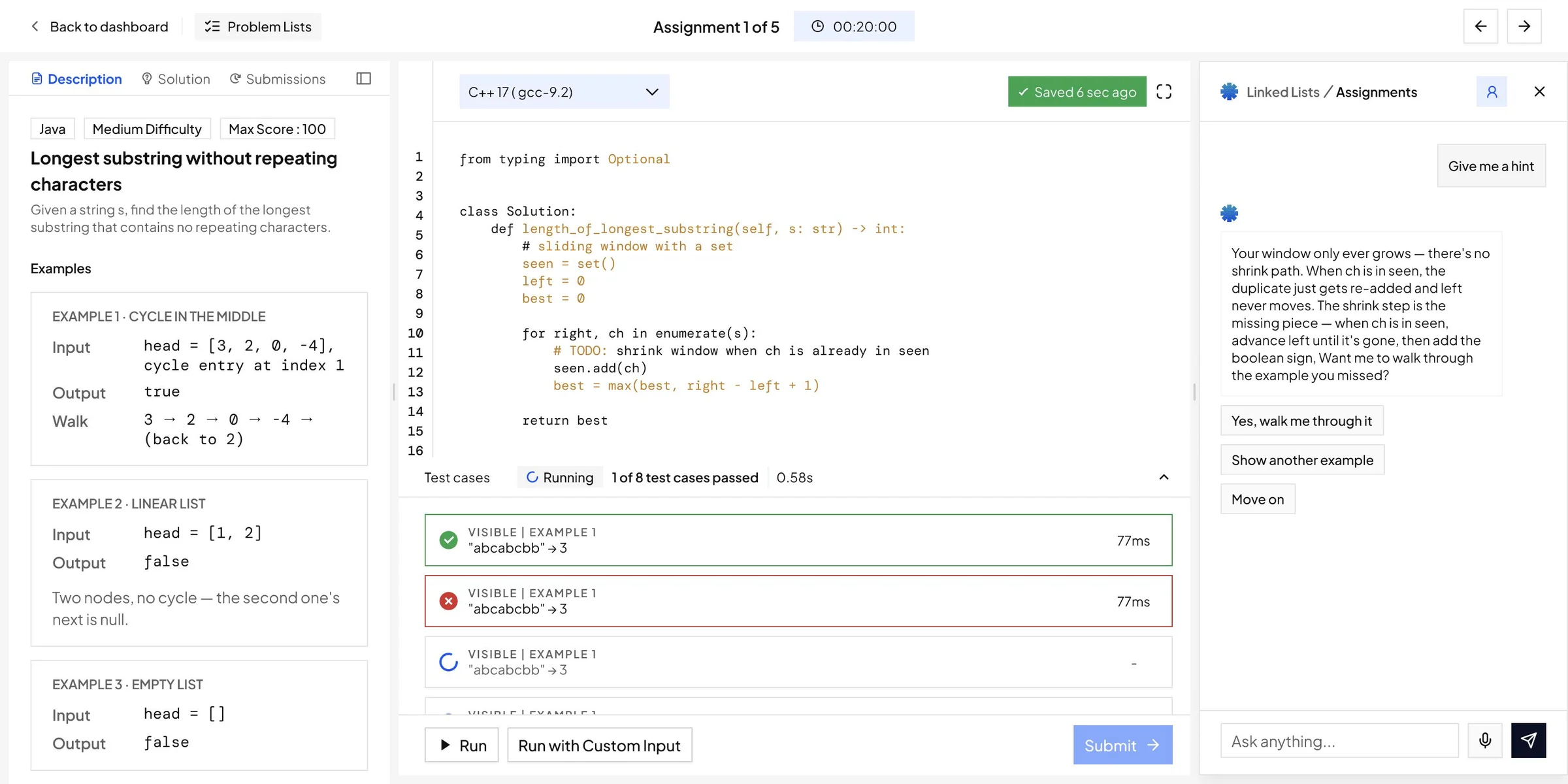
Principle 03, help inside the workflow. The statement, the editor, test results and Companion share one screen.
Two directions I explored
before the weekly plan
Two directions for Path-maker reached a reviewable state before being dropped. Both were built to answer the wrong question.
Path-maker as the full class list
Path-maker opened as the whole program laid out class by class: every phase expanded into modules, every module into classes, every class into primer, live session, assignment and problem set. It looked right because it was complete, and completeness is easy to defend in a review.
What was wrong
It answered what is in this program. A learner with 40 minutes was asking what to do now.
What was wrong
Every item sat at the same visual weight, so the page still handed over a sorting job.
What was wrong
The page grew with the curriculum, while the learner's attention stayed the same.
The same list as a completion checklist
The second attempt kept the structure and added state to it. A checkbox sat on every primer, class, assignment and question, and completion rolled up from item to class to module to phase.
What was wrong
For a learner already behind, the loudest thing on the page became what they had not done.
What was wrong
Ticking every box said nothing about whether the learner could solve the next problem.
What was wrong
It moved sequencing onto the learner, when the system already held enough to sequence the week.
Both described the program instead of naming the next action. The shipped version starts from the opposite end: one week, one clear next action, and the rest of the curriculum reachable rather than resident.
The final design,
piece by piece
Path-maker · owned by me
 1234
1234
1234
1234
-
1
BeforeA calendar in the corner
Dates and class titles in a small box, with lock icons that gave no reason.
AfterA Weekly Plan as the pageEach item has a time, a type, an owner and one action, and the week is the whole page.
-
2
BeforeA contest countdown up top
The biggest card counted down to a contest the learner could not start yet.
AfterTo-Dos for TodayToday's tasks sit in one band, with the date, the stage and the task count.
-
3
BeforeScores in the side rail
Rank, attendance and problem-solving percentages filled the right column.
AfterA Now markerA line at the current time shows what is due next, instead of where the learner ranks.
-
4
BeforePromotions where the plan should be
Five cards for referrals, a master's degree and course pauses filled the middle of the page.
AfterMissed work stays on the planA missed module keeps its slot, marked Missed, with a way back in.
1. A Weekly Plan replaced the dashboard
Problem identified
The home showed the full curriculum and left the learner to work out which part applied to today.
What I did
I scoped the page to one week. Activities organise by date, priority and availability, and everything beyond the week stays reachable rather than resident, so the curriculum can grow without the home page growing with it.
How the compression worked
Four moves carried it: complete journey to current week, curriculum status to one clear action, generic activity row to context-rich task, and hidden dependency to explained unlock.
2. A Now marker and To-Dos for Today named one priority
Problem identified
Calendar, contests, pending actions, practice and promotions all claimed the same level of attention.
What I did
A live Now marker tracks the current moment in the plan, and To-Dos for Today carries the immediate set.
How it solves it
Hierarchy comes from time instead of editorial preference. Above the marker is behind the learner, below it is ahead, and the day collapses to the two or three items that are live.
3. Task cards carried their own context
Problem identified
Activity rows gave a title and a time, so deciding whether to open one meant opening it.
What I did
Each card carries topic, type, instructor, duration, status, the reason it is in the plan and the next action.
How it solves it
The open-or-skip decision now happens before the click. The card structure is generic, so onboarding steps sit in the plan in the same shape as a live class.
Scores with a next step
A score never arrives alone. A contest at 42/100 carries Reattempt, an expired one carries Request Attempt, and a mock interview shows its days left beside Attempt.
4. Locks explained themselves
Problem identified
Locked modules and labels such as "AI Infused Learning 3/4/5" signalled restriction without cause or route forward.
What I did
Locked modules and the Careers Hub stay visible with the condition required to open them.
How it solves it
A lock that states its own condition turns a dead end into a goal. The learner can see what the program expects next without having to ask.
5. Companion sat beside the plan
Problem identified
Companion was a button in the problem screen header and absent from the home, with no knowledge of what the learner was working on.
What I did
Companion opens beside the plan with suggested prompts and carries the conversation without removing the learner from the task.
How it solves it
Asking for help no longer costs the learner their place. The suggested prompts remove the blank-page problem, so support arrives inside the work.
Inside Class
6. One class became four connected moments
Problem identified
The class page opened on a Watch Recording button. Nothing prepared the learner before the session, and Assignment and Feedback sat behind locked tabs with no reason given.
What changed
Each session is organised around prepare, attend, practise and revisit. A Class Rail holds Pre-read, Live Class, Assignments and Practice in view throughout, and locked states say what opens next.
After the session
Recording, chapters, transcript highlights, personal notes, lecture notes, quizzes and flashcards stay attached to that class.
1234
 1234
1234
-
1
BeforeFour tabs, one at a time
Session, Assignment, Additional Problems and Feedback, with locks that gave no reason.
AfterA Class Rail always in viewPre-read, the recorded class, each assignment and practice sit down the left, and locked items say what opens them.
-
2
BeforeA Watch Recording button
The class was a thumbnail and a red button.
AfterLesson and recording side by sideThe lesson reads on the left while the recording plays on the right.
-
3
BeforeA mock interview banner on top
The first thing on the class page was an unrelated mock interview prompt.
AfterOne next stepSolve Problems sits in the top corner, pointing to this class's assignments.
-
4
BeforeRevision tools below the fold
Flashcards, a match game and revision notes sat under the class, apart from the recording.
AfterTranscript and chapters on the recordingHighlights, search and chapter jumps live beside the video, so revising means going straight to the right moment.
Every state of the class, moment by moment.
Prepare
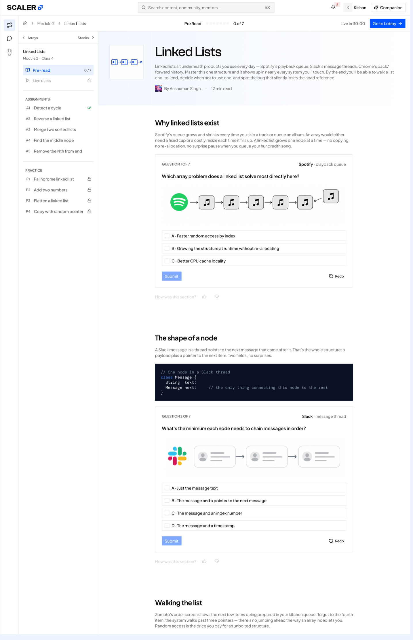
Pre-read
A short pre-read with check questions, and the class rail showing what opens next.
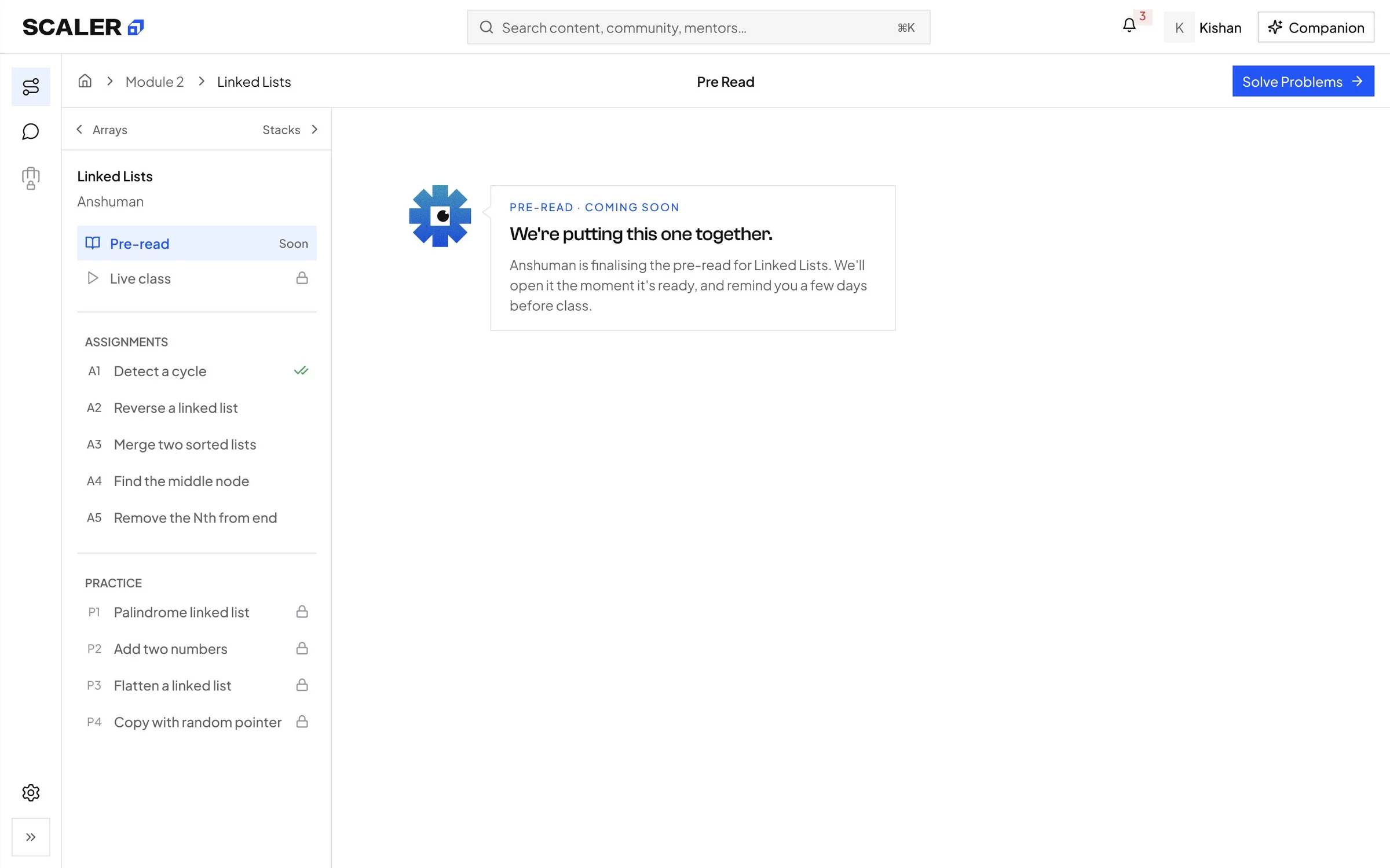
Pre-read coming soon
An empty state that says when the pre-read will land, instead of a blank page.
Attend
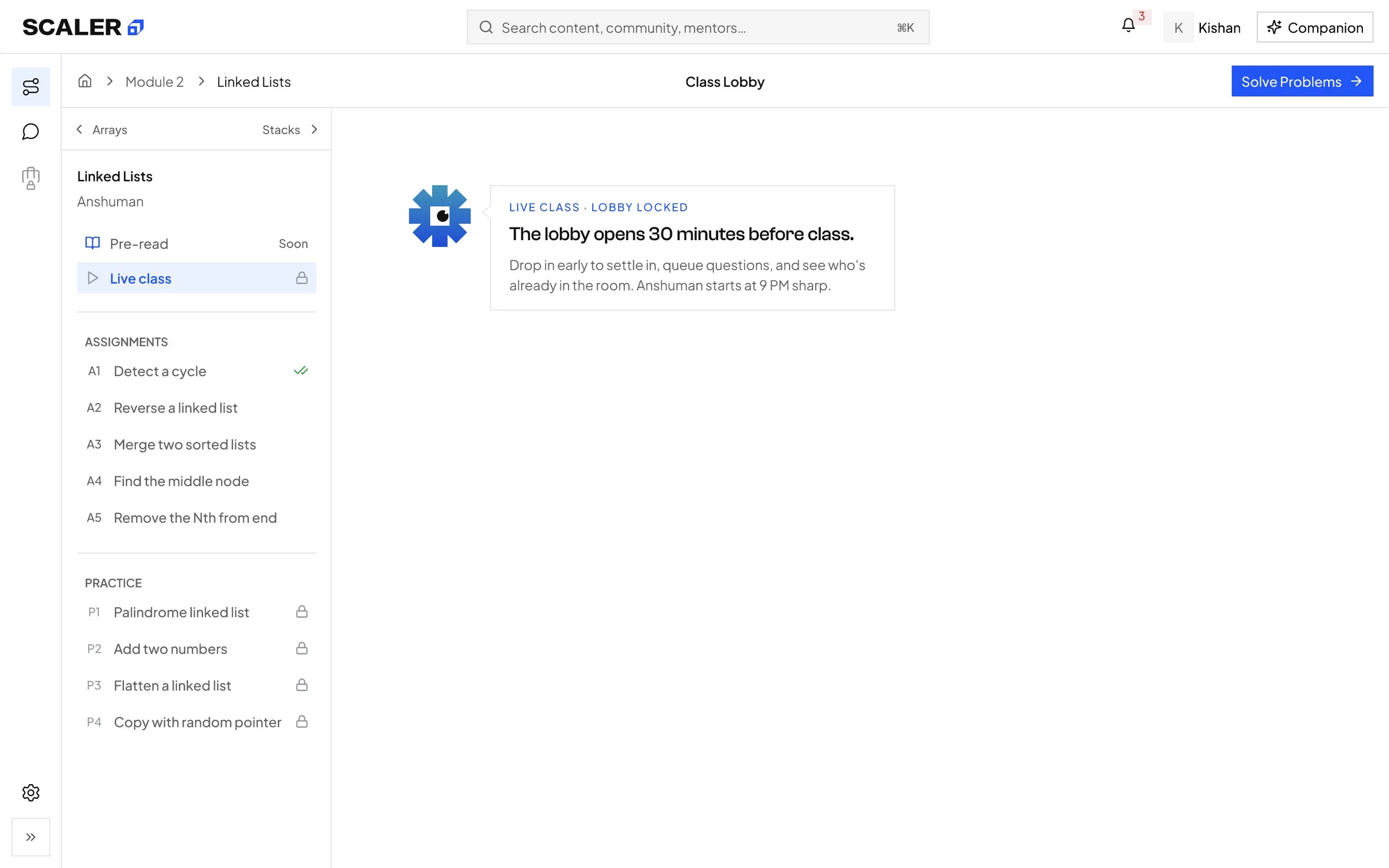
Lobby, before it opens
The lobby stays locked until 30 minutes before class, and says so.
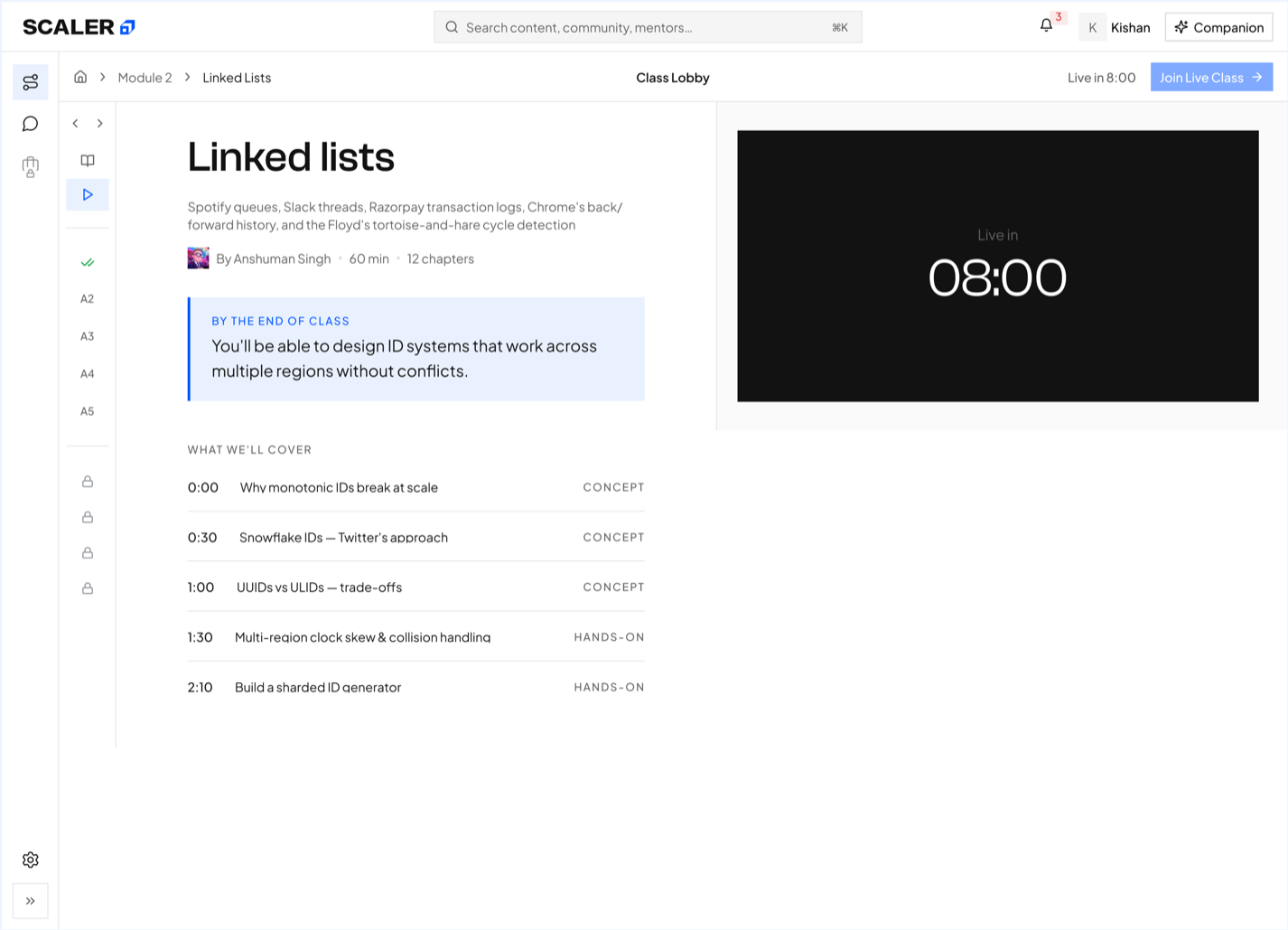
Lobby countdown
A countdown to the live class, with what it will cover, chapter by chapter.
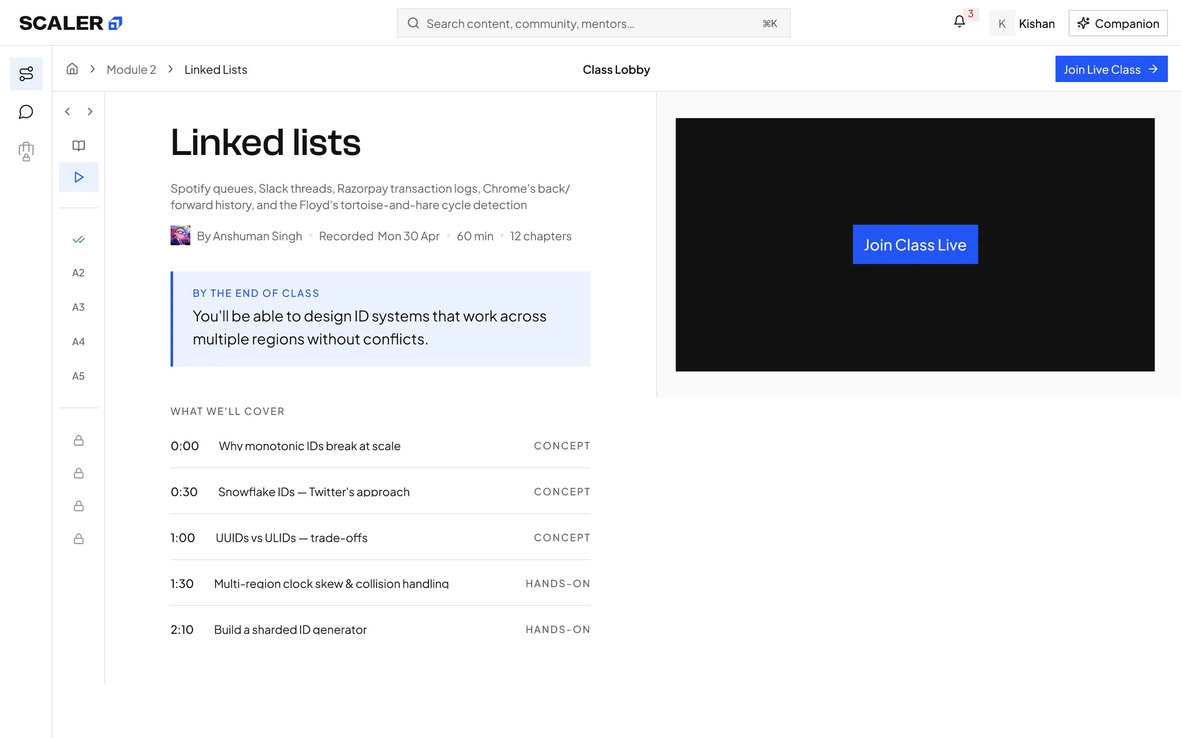
Class is live
The countdown becomes a Join Class Live button the moment the class starts.
Practise
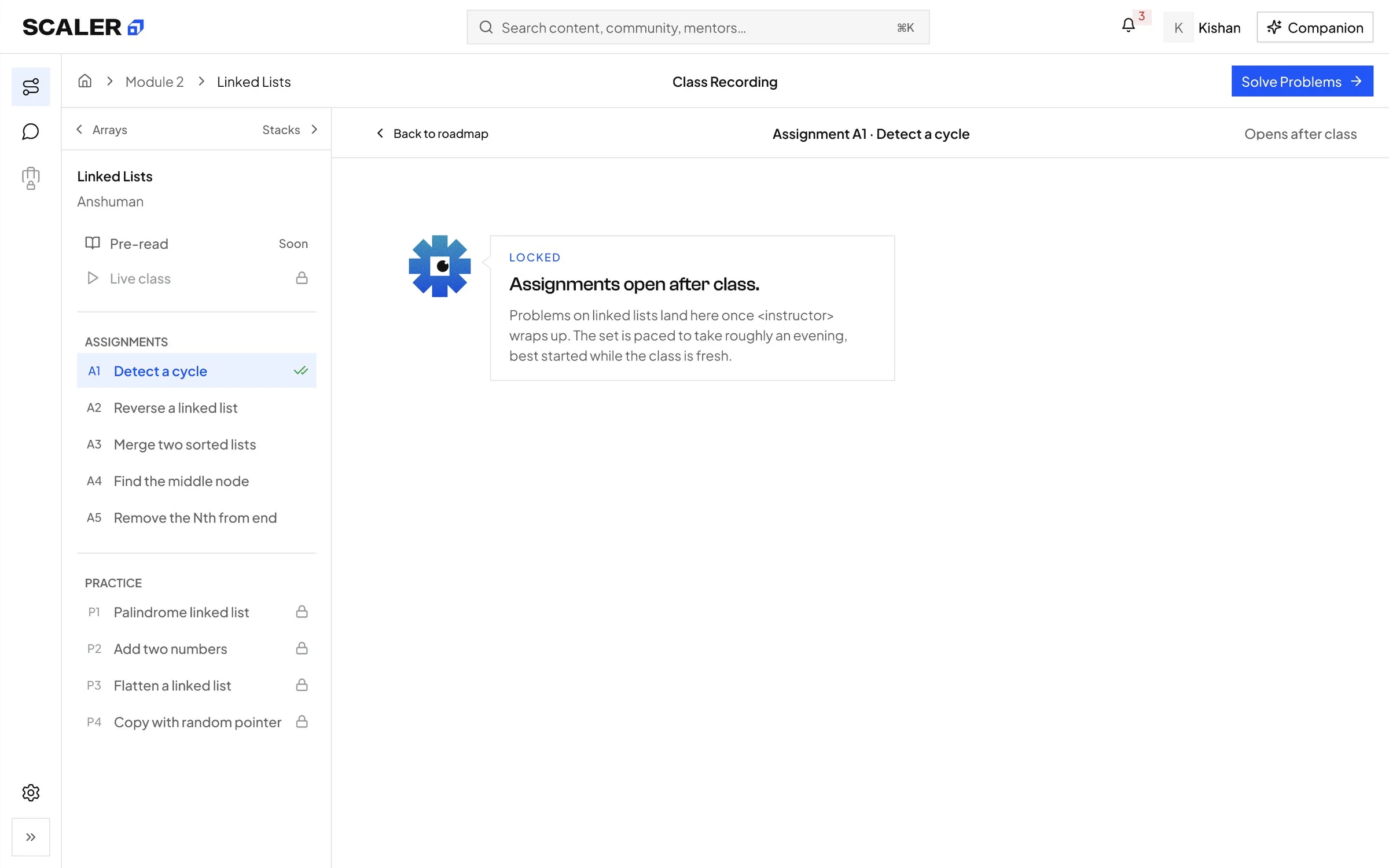
Assignments, before class
Assignments open after the live class, and the locked state says so.
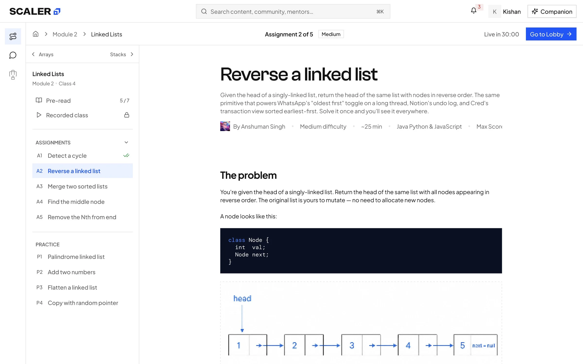
Assignment in progress
The problem opens inside the class, with the rest of the set in the rail.
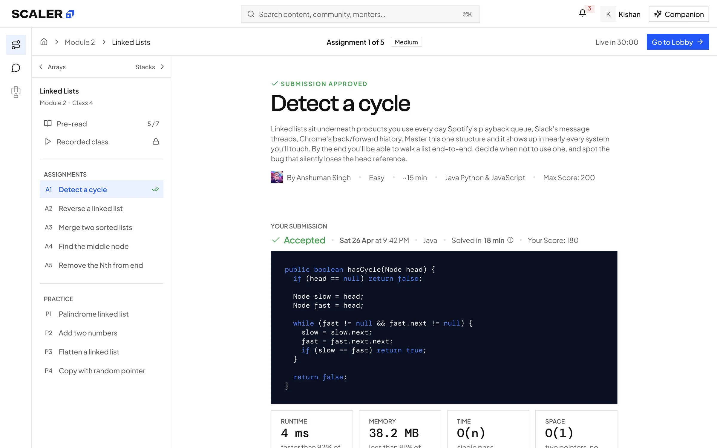
Assignment solved
An accepted submission with runtime, memory and complexity, kept with the class.
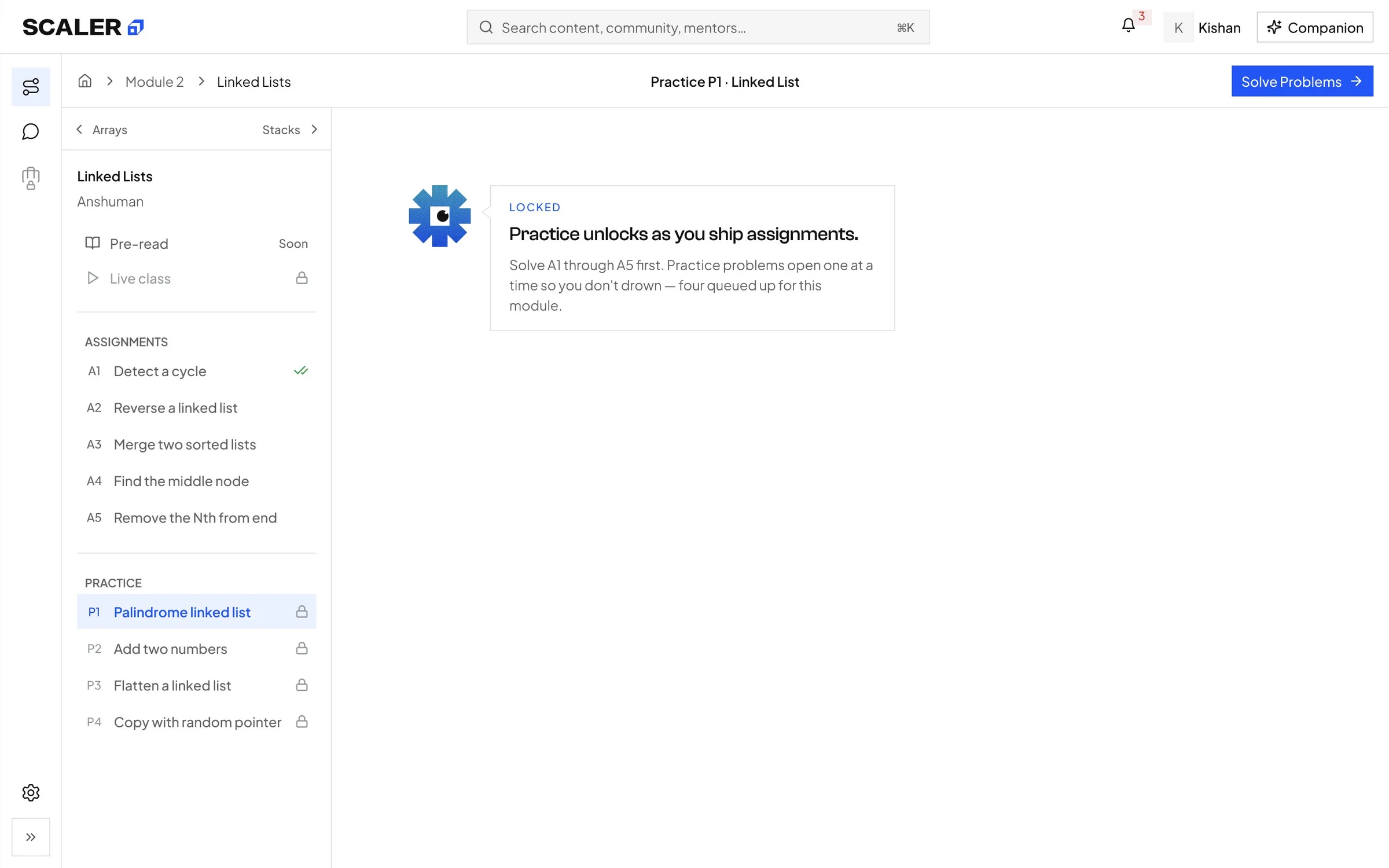
Practice, still locked
Practice unlocks as assignments ship, and the lock names that condition.
Revisit
Recording with transcript
The recording with chapters and a highlighted transcript, next to the lesson.
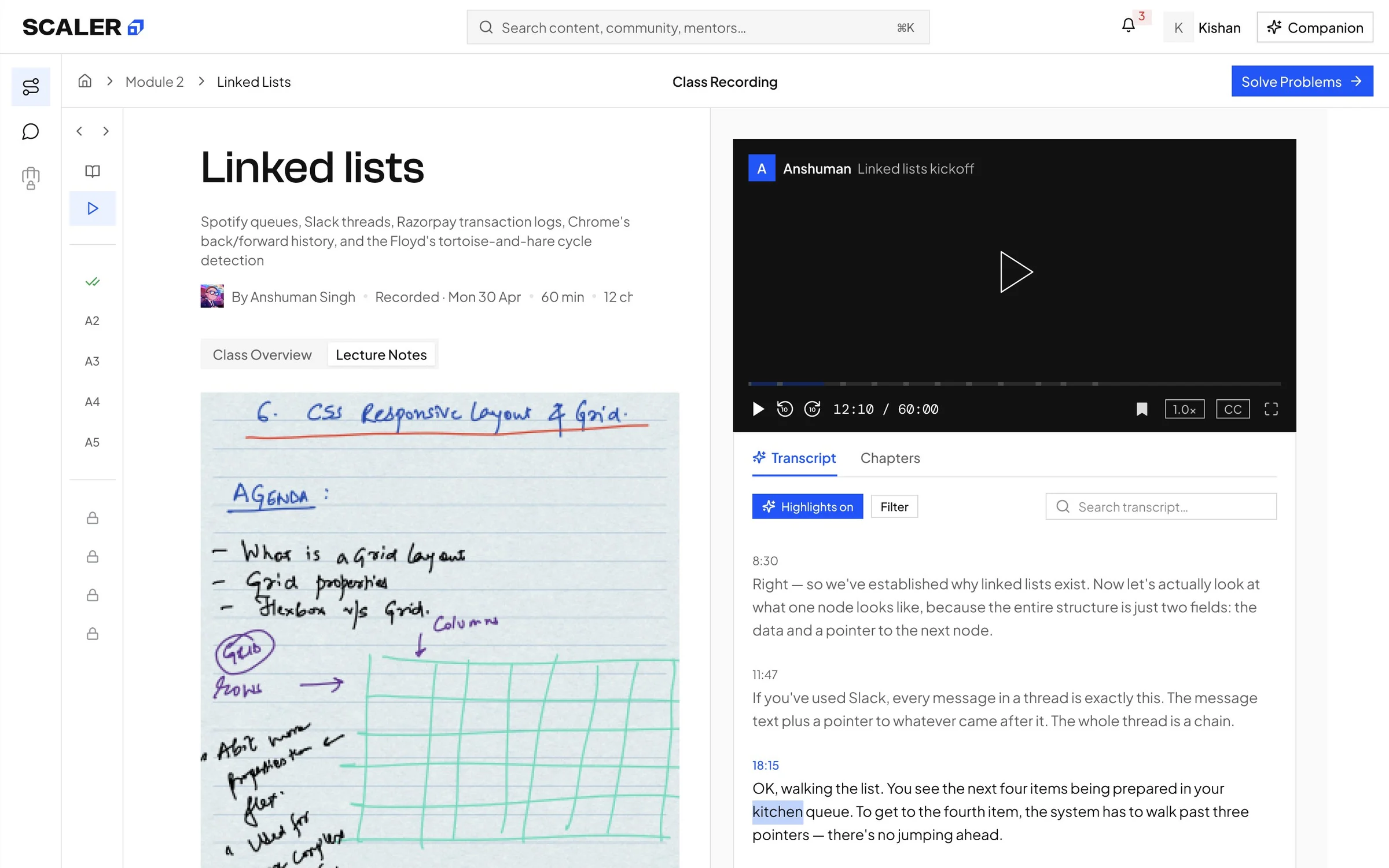
Recording with lecture notes
The instructor's handwritten notes, a tab away from the same recording.
Problem Solving · owned by me
 1234
1234
 1234
1234
-
1
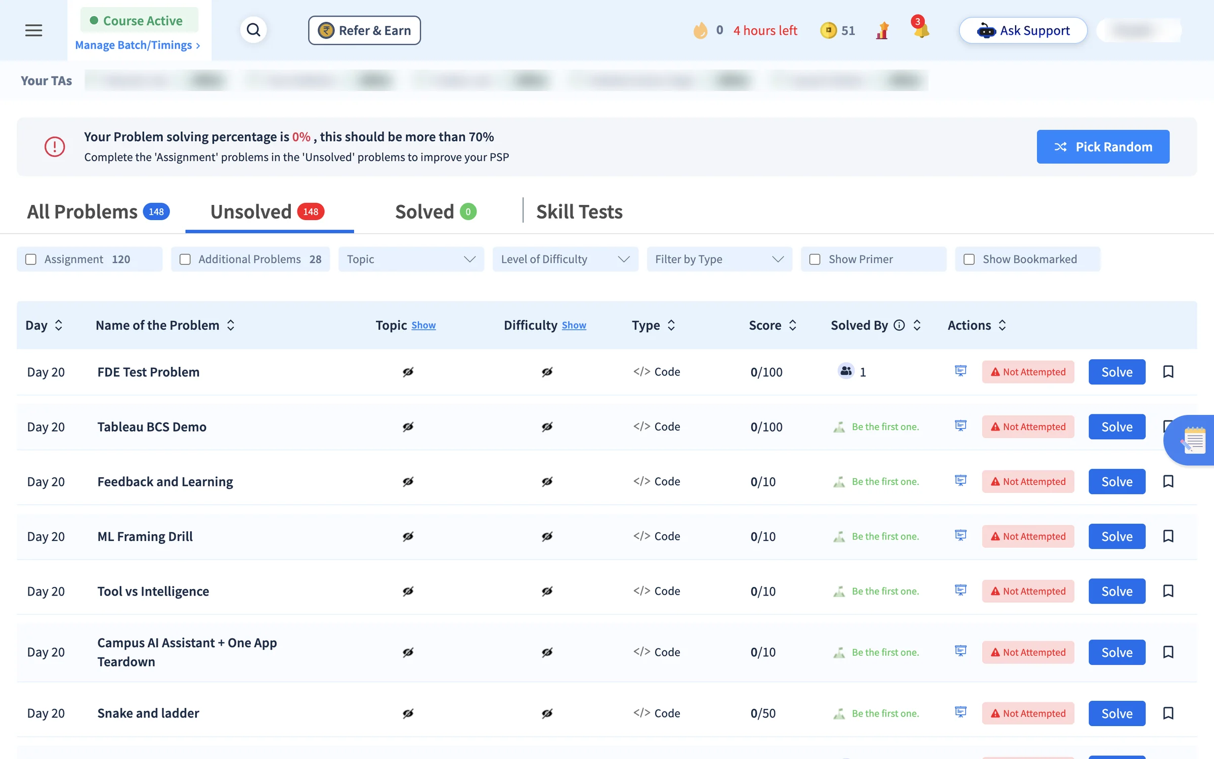
BeforeScore before purpose
The list opened on "Your problem solving percentage is 0%, this should be more than 70%".
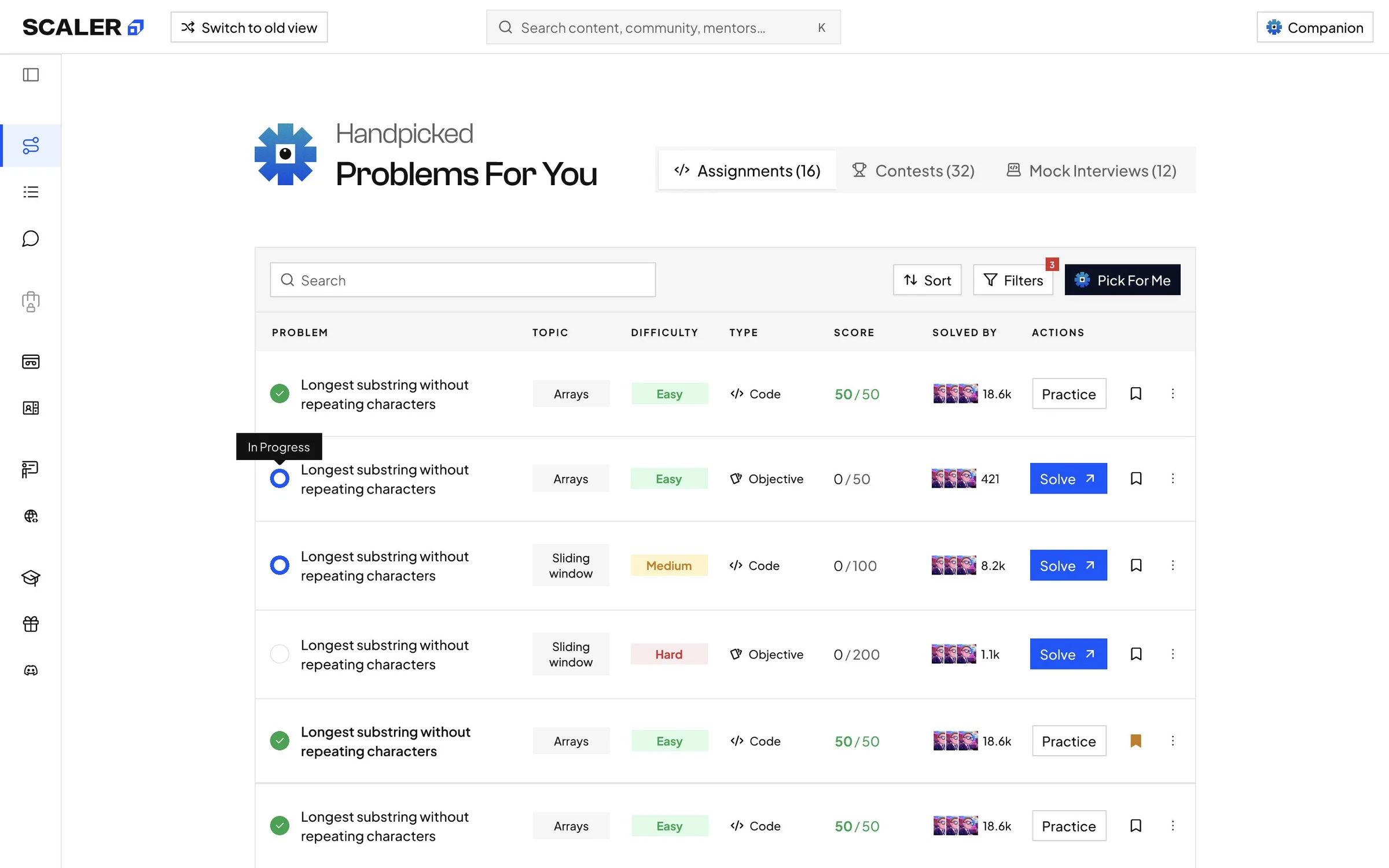
AfterPurpose first"Handpicked problems for you", with Assignments, Contests and Mock Interviews one tab apart.
-
2
BeforePick Random
The only shortcut was a random problem.
AfterPick For MeThe next problem is chosen for the learner, marked with Companion.
-
3
BeforeTopic and difficulty hidden
Both columns sat behind a Show link.
AfterTopic and difficulty on every rowA learner can judge a problem before opening it.
-
4
BeforeNot Attempted on every row
A red warning beside every Solve button.
AfterStatus and one actionA status mark (solved, in progress, not started) and Solve, or Practice once solved.
7. One workspace held the whole attempt
Problem identified
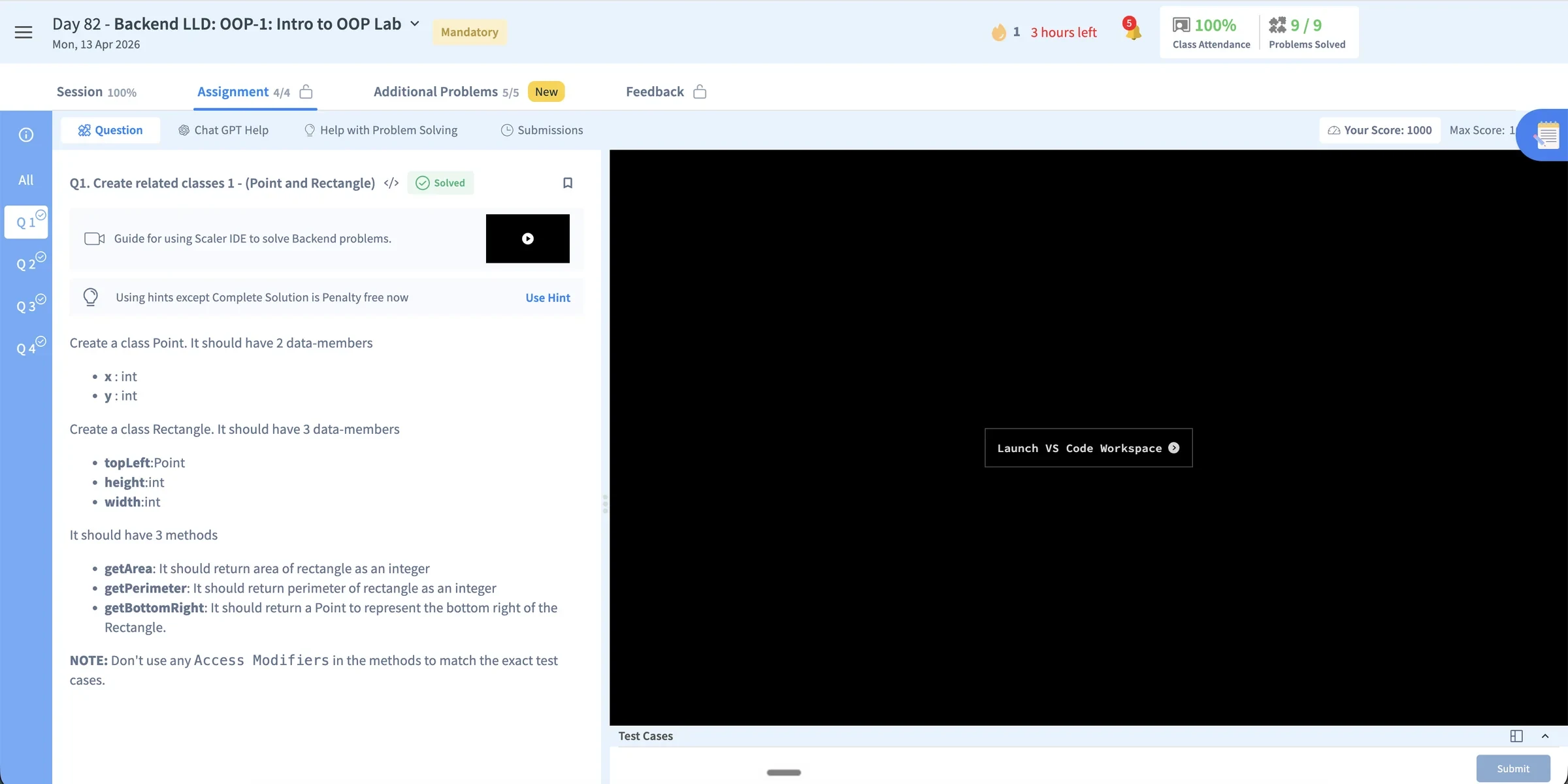
The statement, help and submissions took turns in one panel beside the editor, and lab problems sent the code out to a separate VS Code launch.
What I did
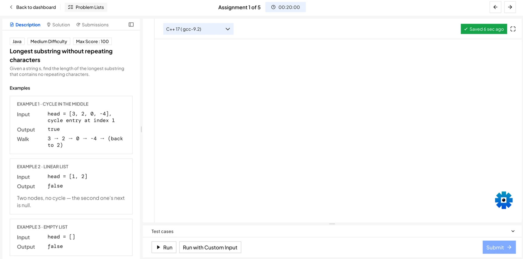
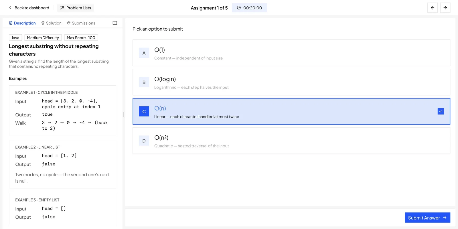
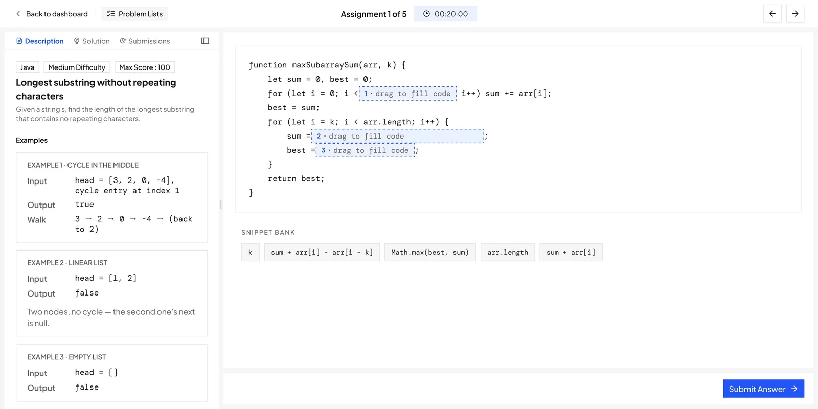
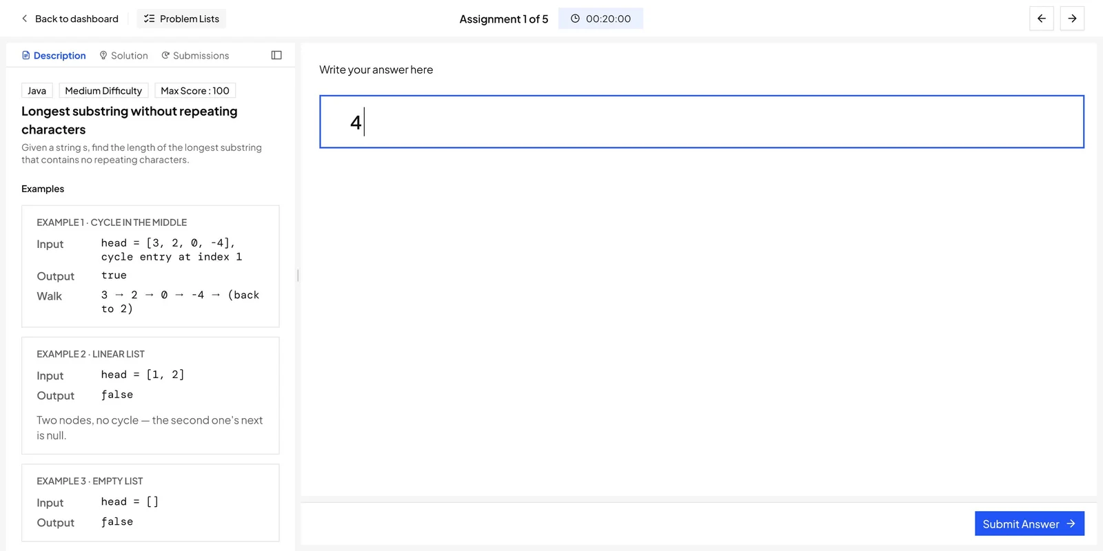
Problem, editor, test cases, submissions and Companion share a single timed workspace, in light and dark themes. All Problem Space pulls assignments, contests and mock interviews into one searchable entry point. The same layout carries code, frontend preview, VS Code launches, multiple choice, drag-to-fill and short-answer problems.
How it solves it
Nothing the learner needs during an attempt is more than a glance away, so rechecking the statement or a previous run costs nothing.
1234
 1234
1234
-
1
BeforeThe class page around the problem
Session, Assignment, Additional Problems and Feedback tabs stayed on top while the learner solved.
AfterA workspace of its ownBack to dashboard, the assignment count, a timer and previous or next. Nothing else.
-
2
BeforeHelp in separate tabs
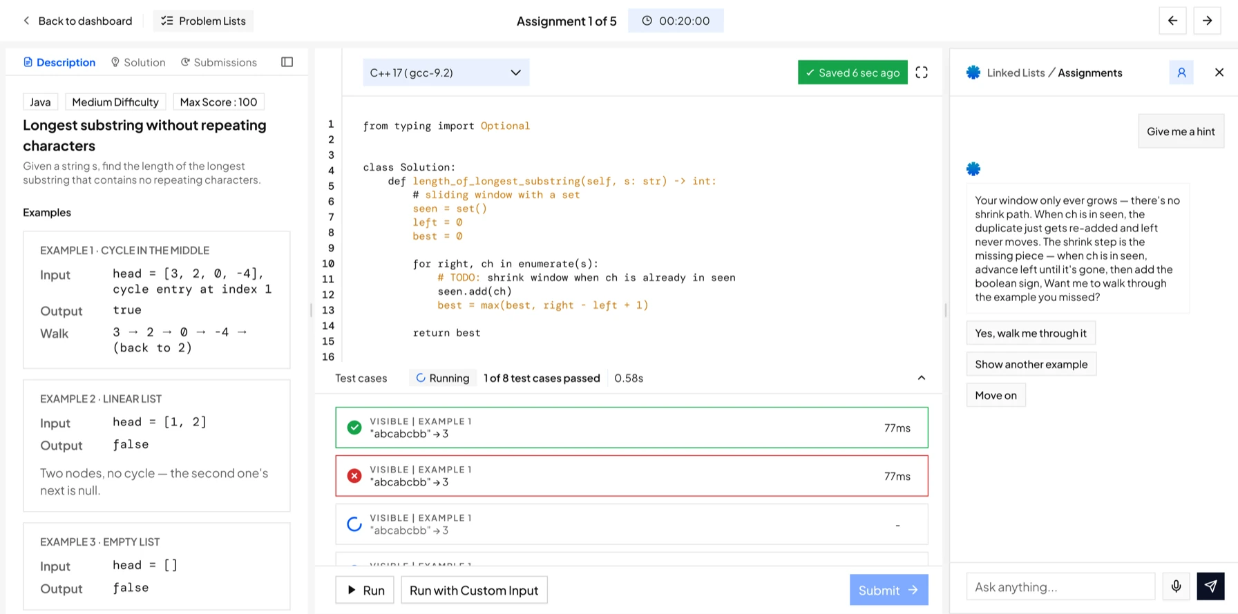
ChatGPT Help and Help with Problem Solving each replaced the question when opened.
AfterCompanion beside the codeHints arrive in a side panel that knows the problem, so the statement and code stay in view.
-
3
BeforeA Launch VS Code button
Lab problems opened a black panel with one button that sent the learner out of the page.
AfterThe editor in the pageThe code is written here, with the language picker, autosave and full screen above it.
-
4
BeforeTest cases folded away
A thin Test Cases strip sat under the panel, closed by default.
AfterResults under the codeEach run shows how many cases passed and which ones failed, right below the editor.
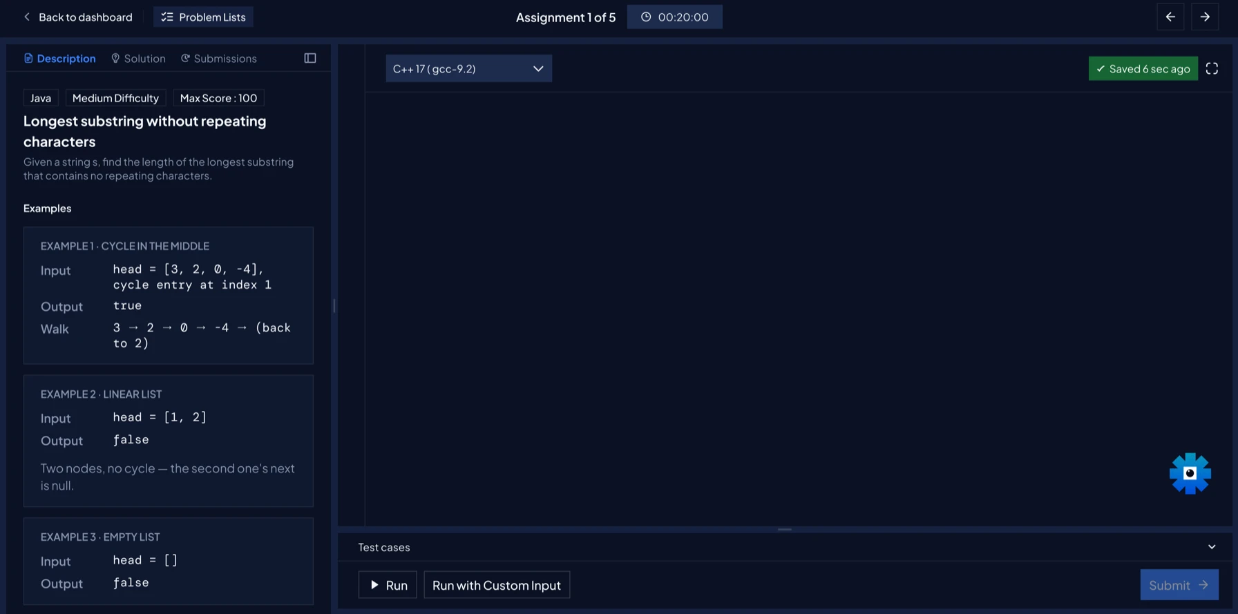
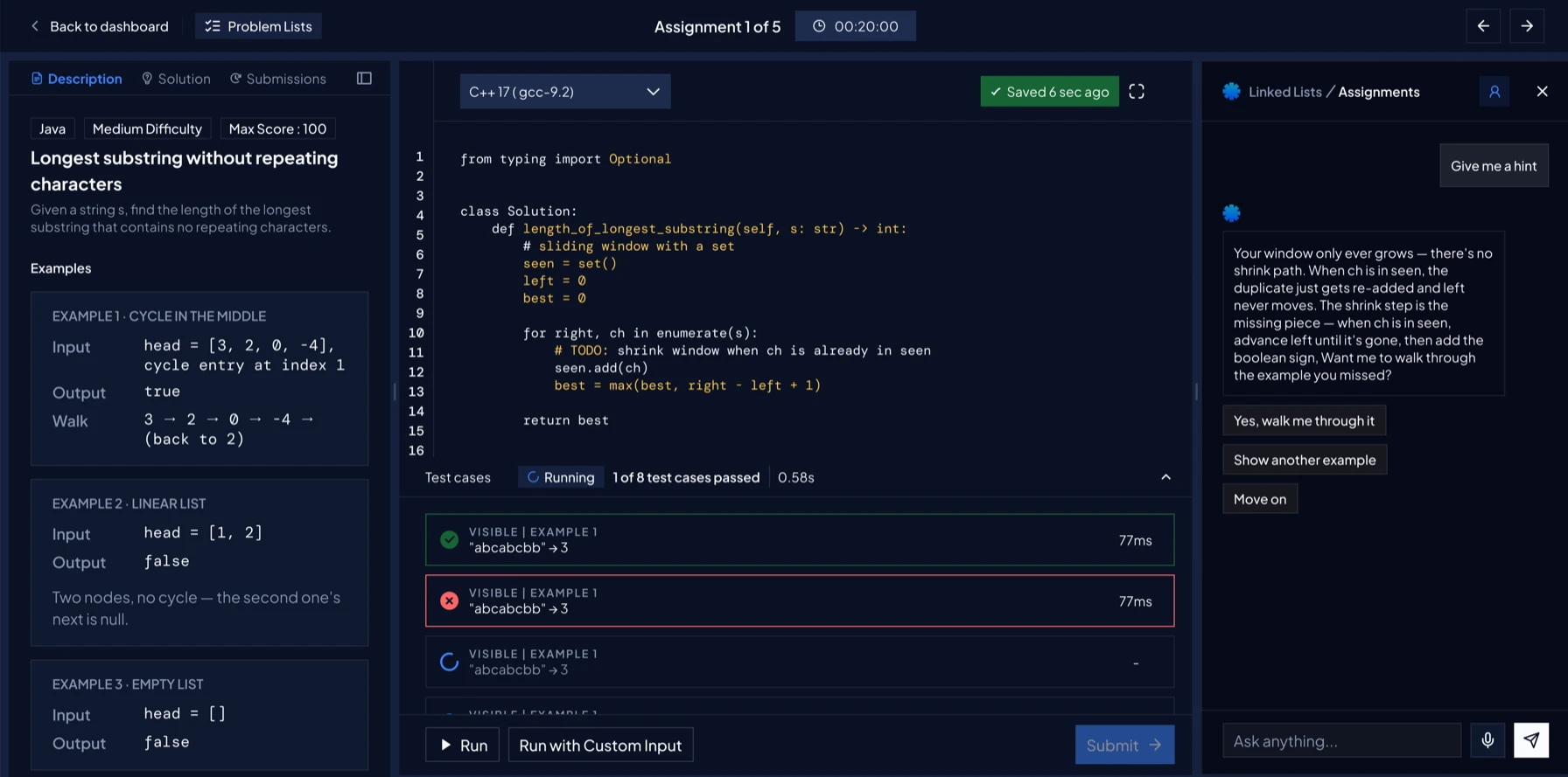
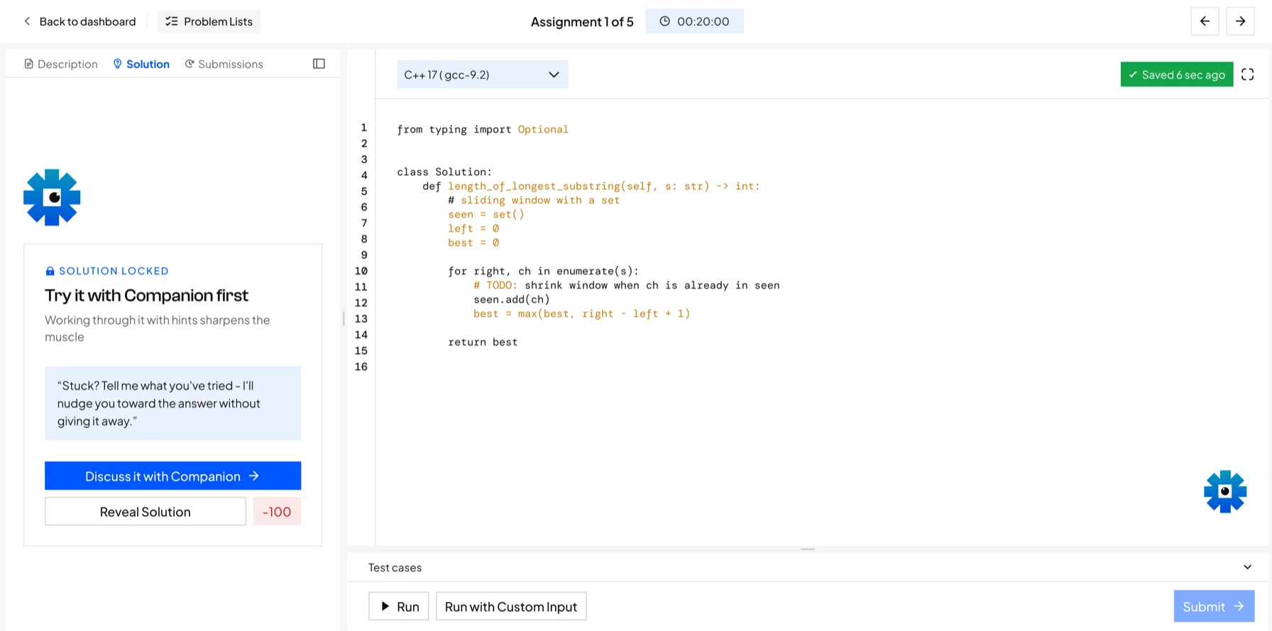
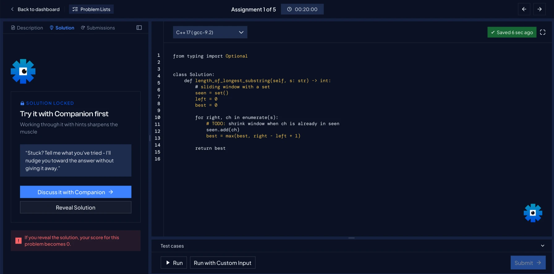
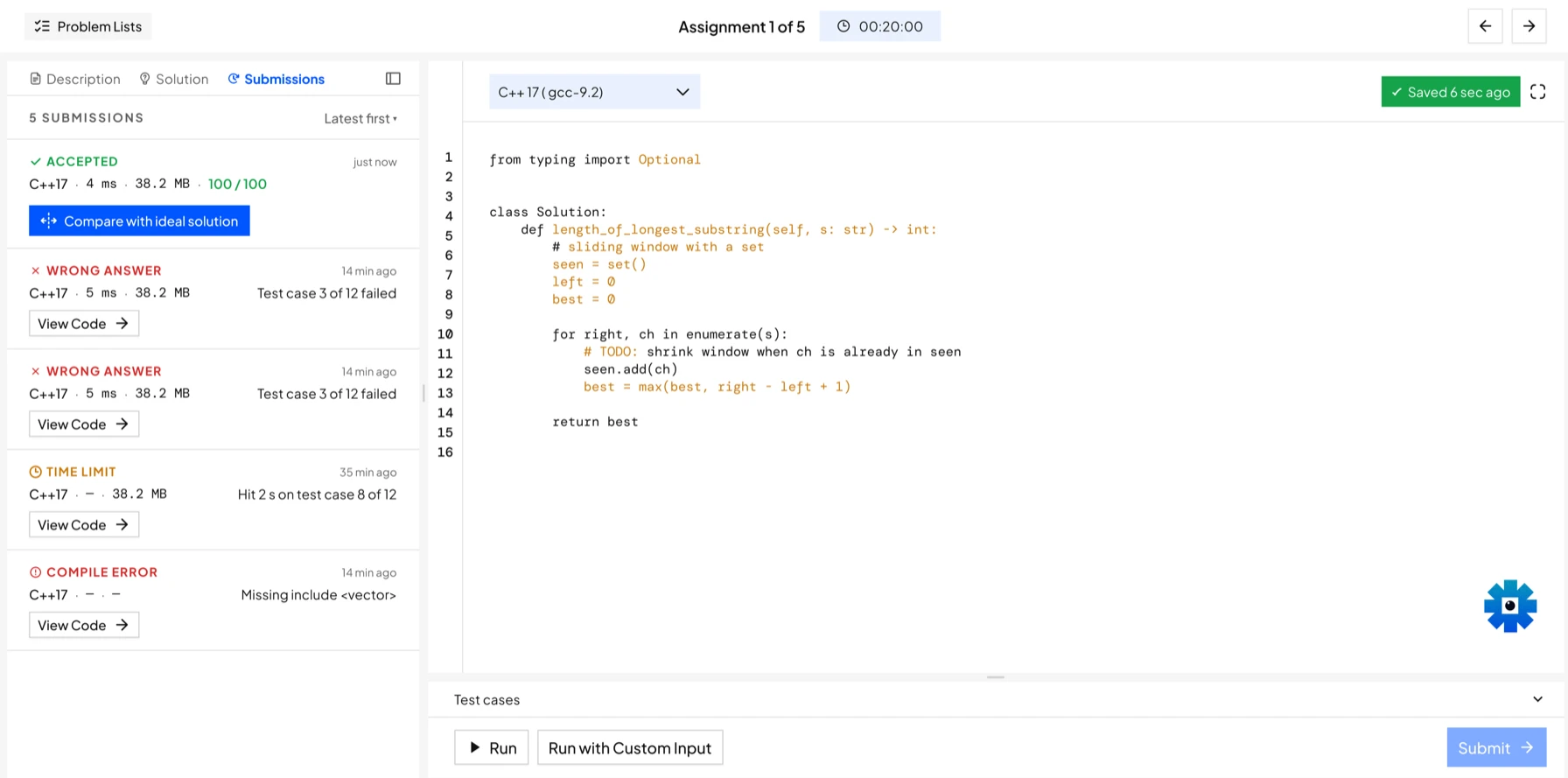
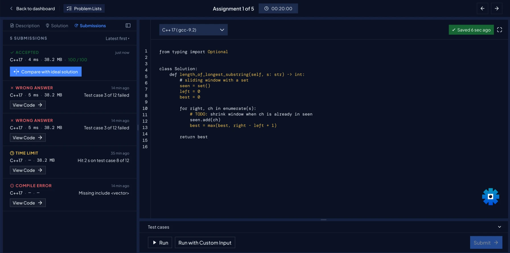
One layout, six problem types.
Code
The language picker, autosave and full screen sit above the editor, with test cases below it.
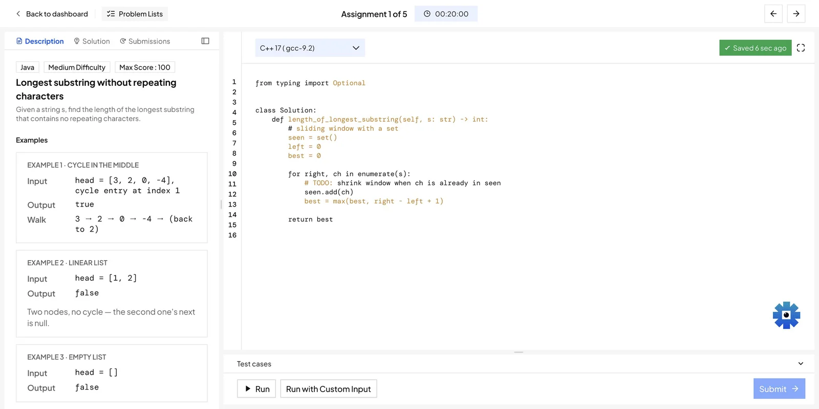
Frontend · preview
Files sit beside the editor, and Show Preview renders the page without leaving the workspace.
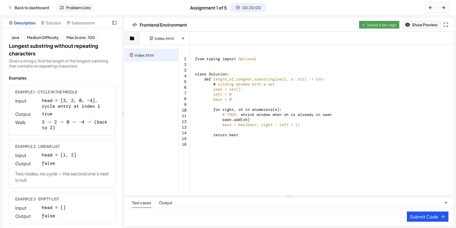
VS Code · launch
Lab problems pick a stack and run a short checklist before the workspace opens.
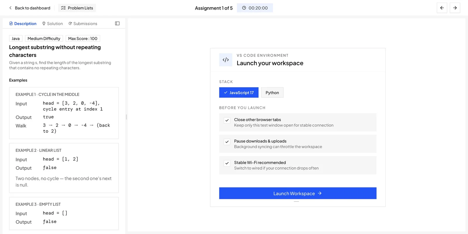
Multiple choice
Each option carries a one-line reason, so the answer explains itself.
Drag to fill
Blanks in the code take snippets from a bank below, for problems about reading code, not writing it.
Short answer
One input and a Submit Answer button, with the statement still on the left.
8. Six help systems became one path
Problem identified
A stuck learner had to choose a support system before receiving any support.
What I did
Support escalates along a single path, from Companion hints through to a TA by text or video.
How it solves it
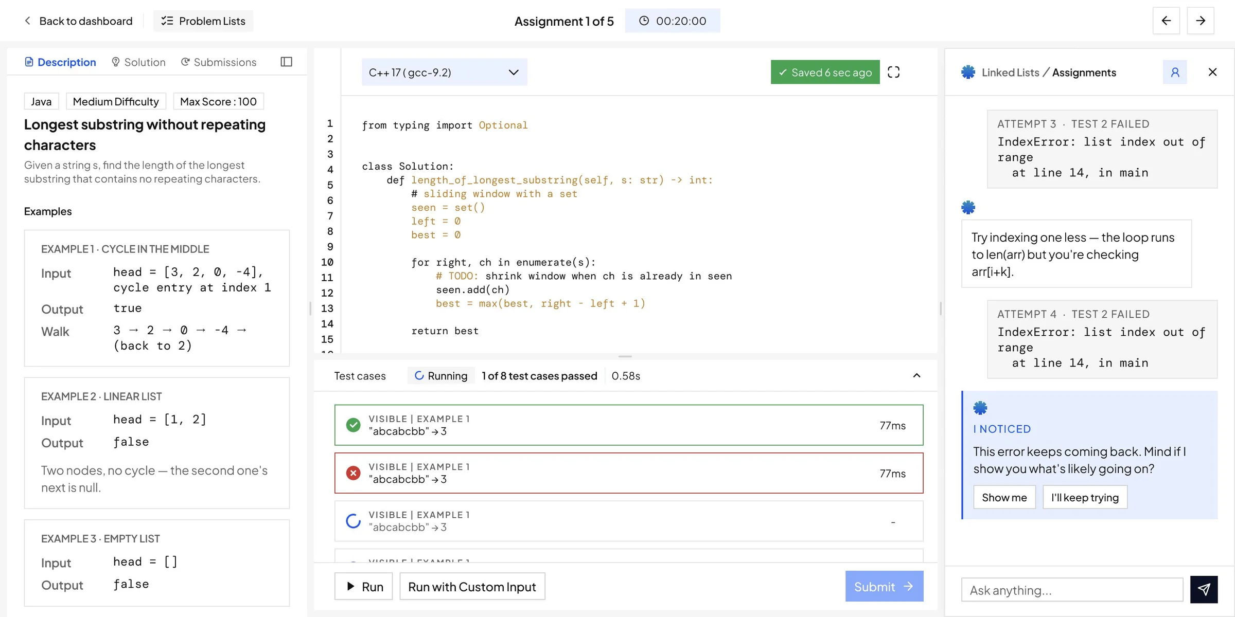
Removing the choice removes the decision that was blocking help. Companion reads the failing test and earlier threads, so its first nudge is about this attempt. The conversation is saved as the learner escalates, so a TA arrives with a record of what has already been tried.
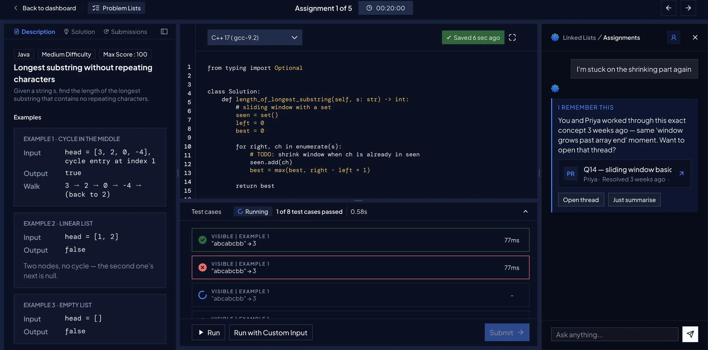
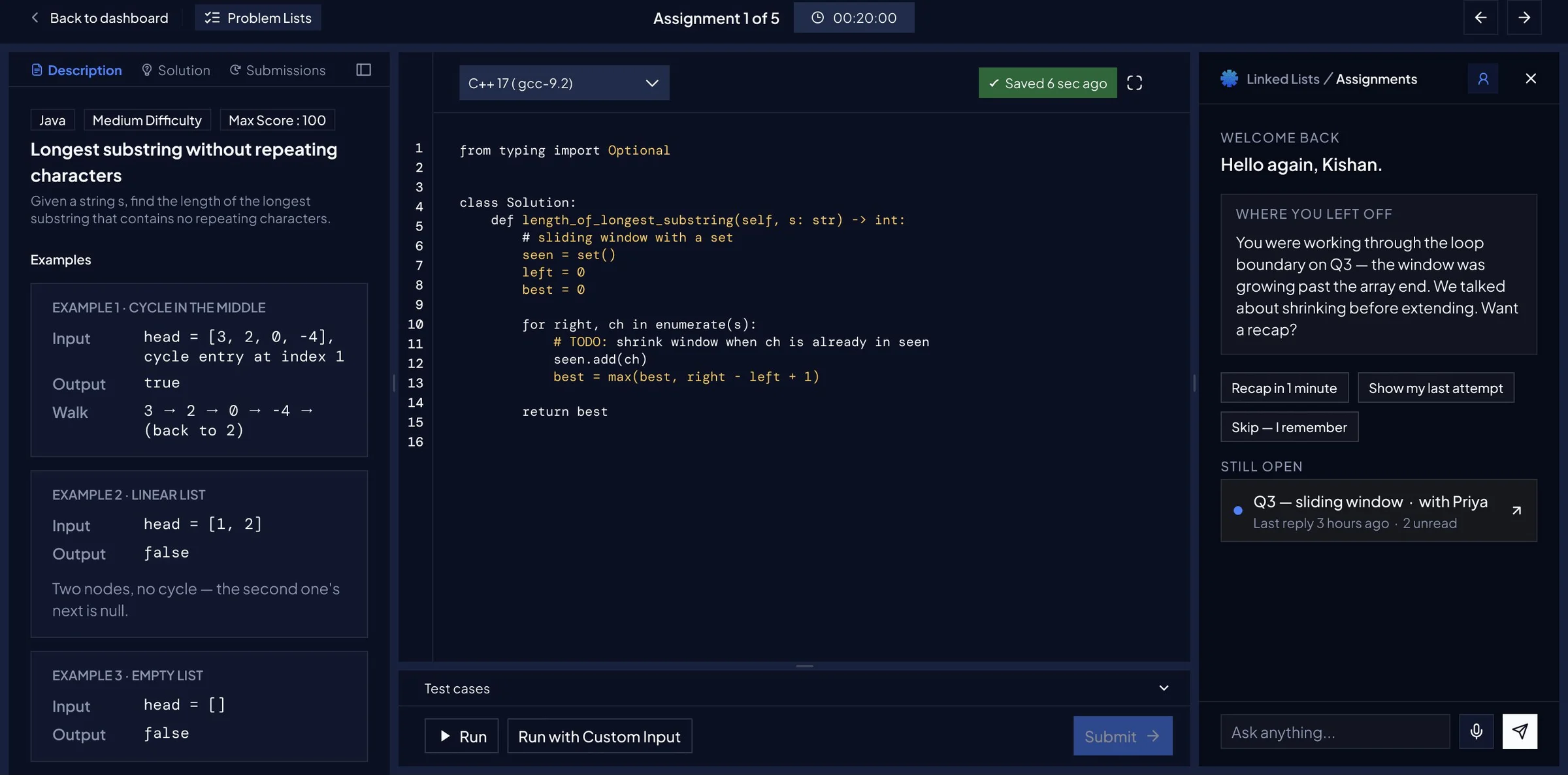
Companion inside the attempt, as the first step of one escalating path.
Notices a repeated error
The same IndexError shows up in two attempts, so Companion points it out and offers to show what is going on.
Recalls an earlier thread
Stuck on the same idea again, the learner is pointed to a thread on this concept from three weeks ago, already resolved.
Recaps where they left off
On return, Companion says where the learner stopped, offers a one-minute recap and lists what is still open.
| Before | Old cost | After | New cost |
|---|---|---|---|
| Chat GPT Help | None | Companion, in the workspace | None |
| Use Hint | None | Progressive hints | Reduced |
| Solution Approach | None | Companion-first prompt | Reduced |
| Complete Solution | −50% | Revealed solution | Zero |
| Tutorials and TA requests | None, after every free hint | TA by text or video, with the attempt history attached | None |
9. Scored friction made the cost of a shortcut explicit
Problem identified
On a platform where the answer is always available, the easiest path is to read it. Hints were free and the complete solution cost half the score, so reading the answer was the cheapest route.
What I did
Hints reduce the available score. Revealing the complete solution sets it to zero, and the cost is stated before the learner commits.
Why keep the shortcut
Someone genuinely stuck still needs it. It stays available, and it is no longer the cheapest route through the problem.
10. Submission history connected to the next attempt
Problem identified
The submission table recorded an answer and a runtime, detached from the error and the guidance used.
What I did
Submission history separates Accepted, Wrong Answer, Time Limit and Compile Error, and sits beside the code. Any run can be compared with a reference solution, with a short note on why that approach works.
How it solves it
A failed run reads as a next step rather than a score. The learner can see what changed between attempts without leaving the editor.
Work that went beyond
the brief
The brief was a home page and two connected surfaces. Four pieces of the work were not in it.
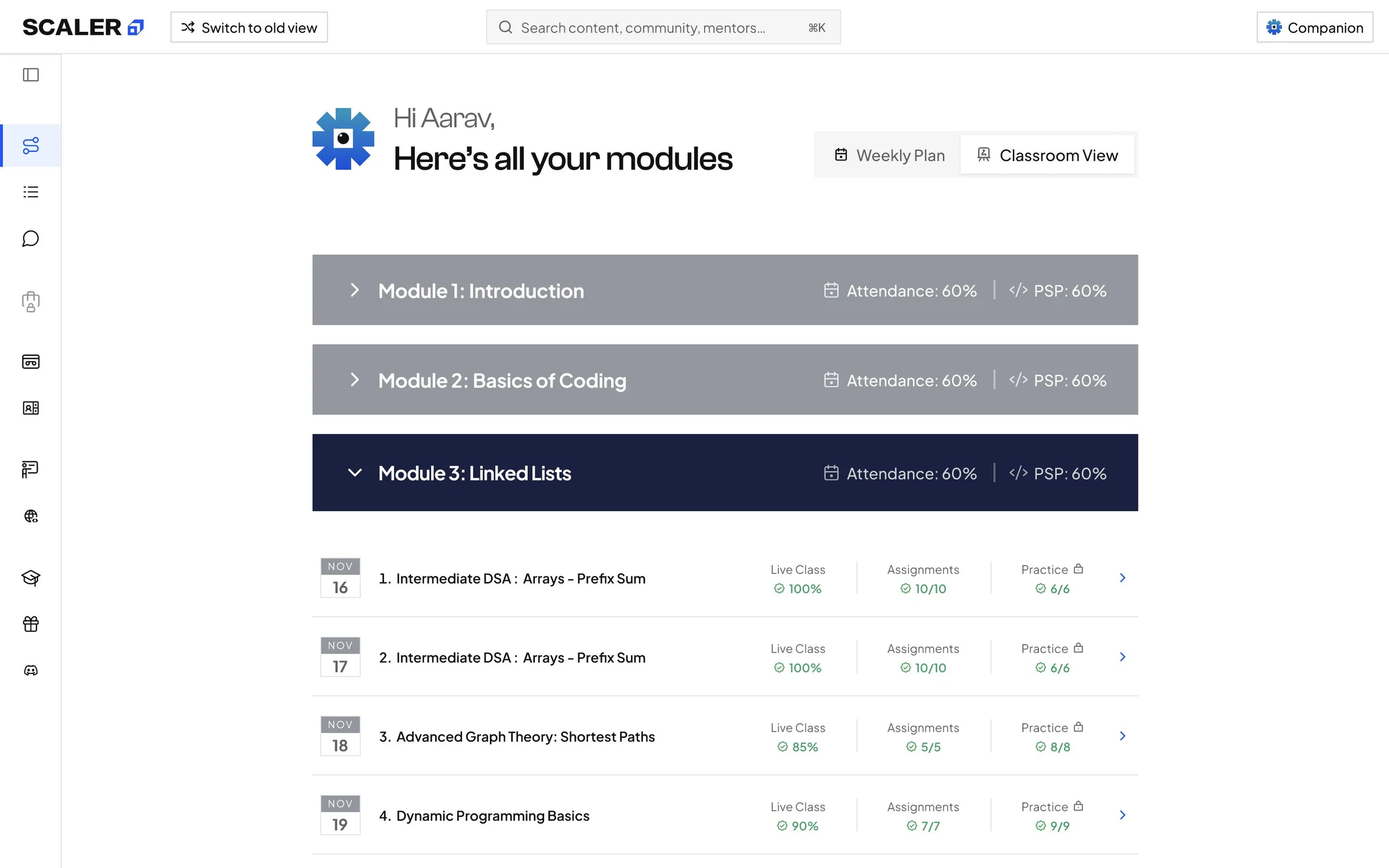
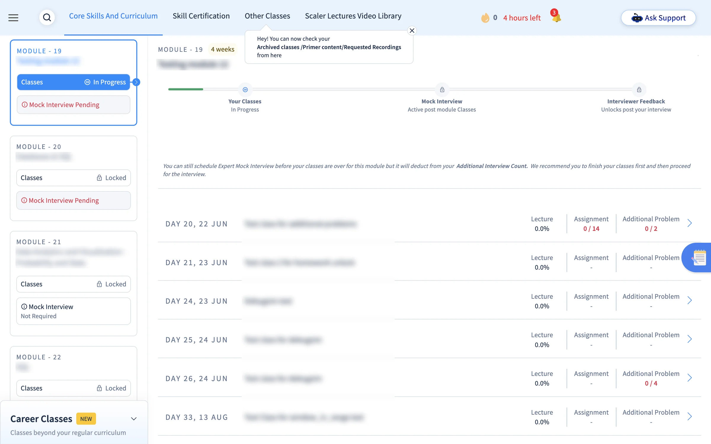
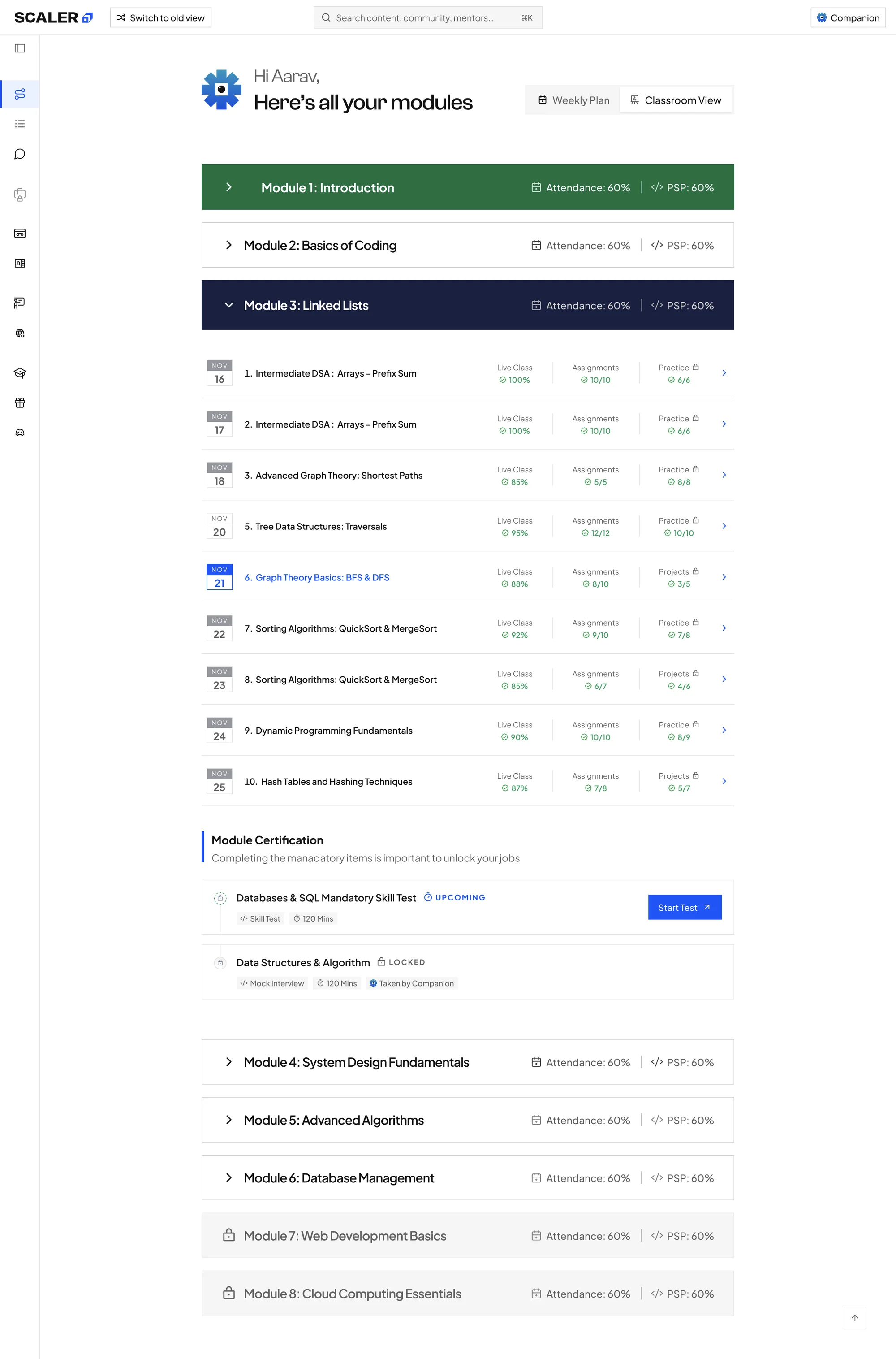
11. A journey model that became Classroom View
What I did
Compressing a full program into one week's plan needed a map of the whole program first. I built a model covering onboarding, eight learning modules and career preparation across 14 visible states.
Why it mattered
It made the compression decidable, then shipped as Classroom View: the whole curriculum, one toggle away from the Weekly Plan. The plan can stay short because nothing beyond the week is hidden.
 1234
1234
 1234
1234
-
1
BeforeModules in a side column
Each module was a card in a narrow left rail, most of them marked Locked.
AfterModules as the pageEach module is a full-width row, and the open one lists its classes in order.
-
2
BeforeA three-step tracker
Your Classes, Mock Interview and Interviewer Feedback sat on a progress line, two of the three locked.
AfterOne toggle from the planWeekly Plan and Classroom View sit side by side, so the whole program is one click away.
-
3
BeforeLecture 0.0% on every row
Each class reported lecture progress, assignments and additional problems, mostly a zero or a dash.
AfterLive Class, Assignments, PracticeEach class shows the three things it asks for, with a tick and a count.
-
4
BeforeMock Interview Pending in red
A warning sat on every module card, before its classes were done.
AfterProgress on each moduleAttendance and problem-solving percentages sit on each module bar, so a learner sees where they stand before opening it.
12. Operational onboarding moved into the plan
What I did
The brief covered learning activities. The manager call, batch allocation, mentor selection and Meet n Greet sat in a separate Actions Pending list. I gave them the same task-card structure.
Why it mattered
A learner's first week now reads as one plan instead of two competing lists.
13. Every state made switchable before review
What I did
All 16 personas and every empty, locked and error state were switchable in the prototype.
Why it mattered
Edge cases reached design review while they were still cheap to change, instead of surfacing during build as engineering questions.
Four of the edge cases resolved in prototype review.
No classes this week
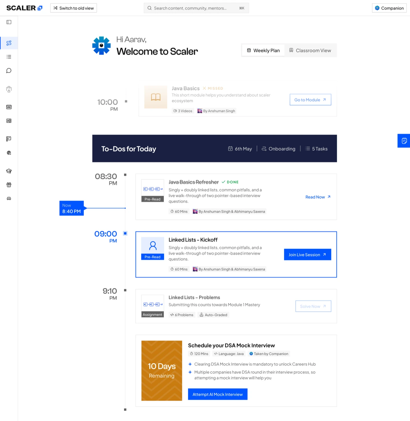
Today says no class is scheduled, and the next day's To-Dos sit right under it, so the page still names something to do.
Course paused
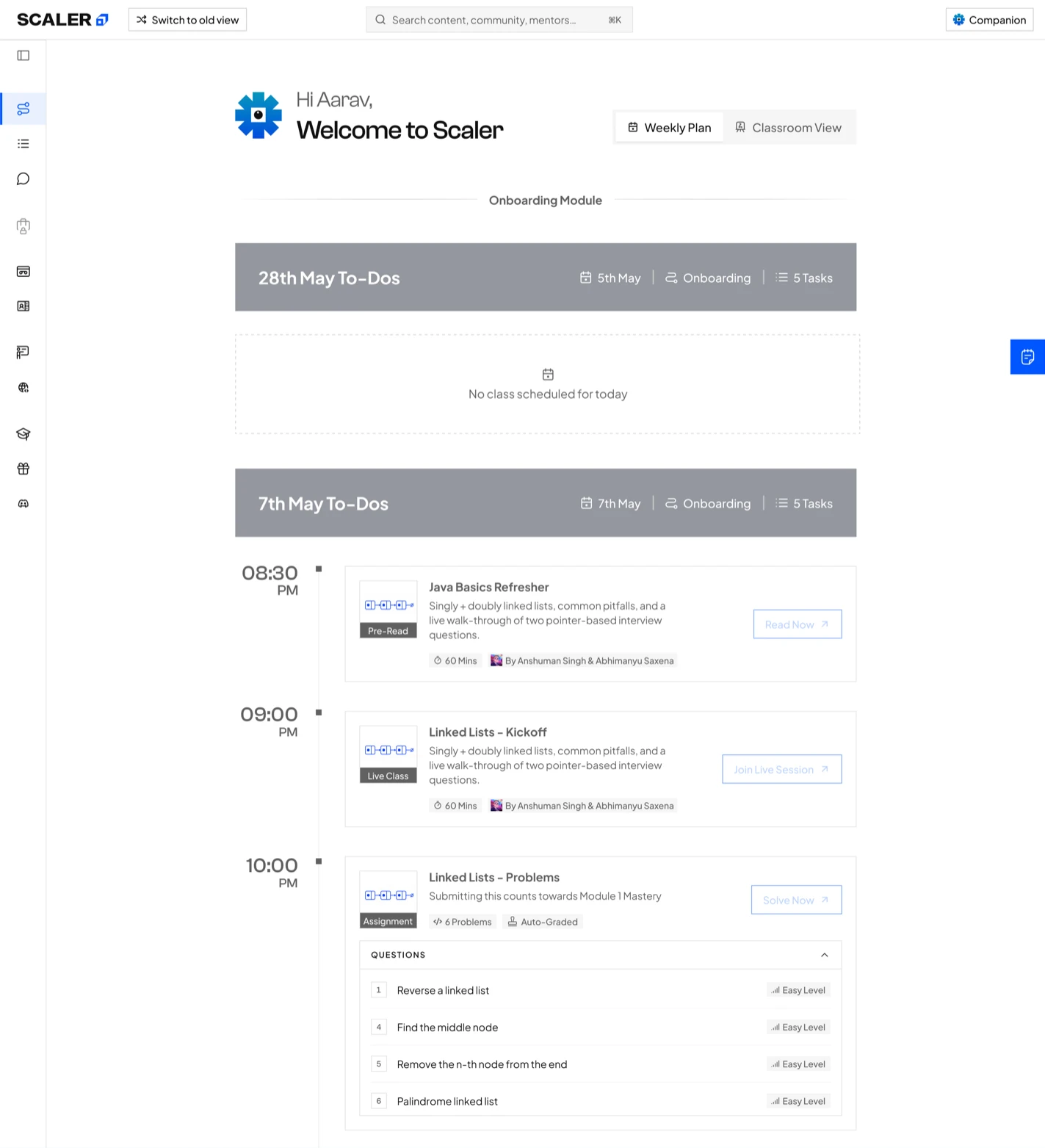
The header says the path is paused for three months, and the plan closes on the pause dates and what happens on return.
Mock interview upcoming
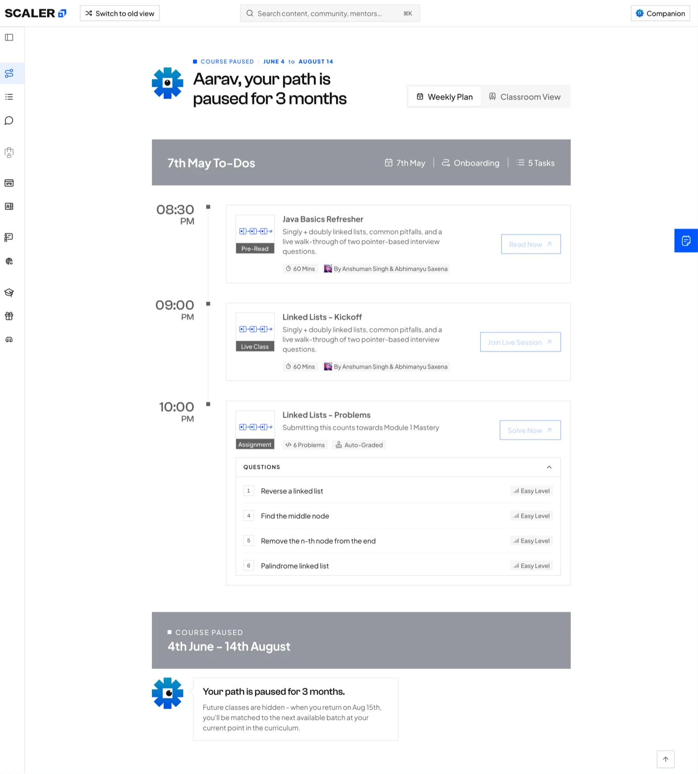
A fixed mock interview sits in the plan with 10 days remaining, sequenced against the adaptive work around it.
Mock interview expired
A missed mock interview stays on the plan, marked Expired, with a way to take an additional one.
14. The prototype shipped as a handoff artefact
What I did
I mapped interaction logic, learner states and edge cases in a working browser prototype built with Claude and Claude Code. Stakeholders approved direction from something they could click, and I translated the approved flows into production screens on Syntax by Scaler.
What changed
Engineering normally receives a Figma specification. I shipped the approved HTML prototype alongside it, so interaction and state change did not have to be reconstructed from static screens during build.
- Final screens for all three surfaces
- Every empty, locked and error state
- Component behaviour
- Design-system usage on Syntax by Scaler
Describes what a state looks like.
- Interaction logic as built and approved
- State changes and their triggers
- All 16 personas, switchable
- Edge cases already resolved in review
Shows when a state changes and what triggers it.
Impact after release
The redesign shipped in the order learners meet it: Path-maker first, then Inside Class, then Problem Solving. It was opt-in, with Switch to old view on every screen, and launched in the week of 15 July 2026. Usage figures run from launch to 4 October 2026. Adoption figures are from the first launch cohort.
Sustained use · launch to 4 Oct 2026
Learners a week on the new home on average, 11 weeks running
Lowest and highest week since launch. No week fell below 600
Learners a day on the new home, last 30 days
Adoption · first launch cohort
134 of 226 paid learners switched the new LMS on at least once
Switch to old view stayed on every screen, so every one of them chose the new LMS
Discovery · from the home, within seven days, last 30 days
Reached Core Curriculum classes
Reached All Problems
Both held in a narrow band week to week since launch
Numbers I'll walk through on a call
How many learners stayed on the new LMS
On a callAdoption by program
On a callWhere learners went next from the home
On a callSearch and help usage
On a callUsage and discovery figures are from Mixpanel. Cohort figures are from the launch cohort report.
What I would do
differently next time
- Agree a retention measure before launch. With a retention measure defined up front, the first cohort could have shown whether a clearer week kept learners studying, which is the question the redesign was built around.
- Match the medium to the decision stage, from day one. HTML for validating behaviour quickly, Figma for the precision handoff needs. Static screens get approved on how they look. Prototypes get approved on how they behave, and behaviour is what ships.